Euro Banknotes Between Neutrality and Identity — Sight Regimes III
Euro banknotes appear neutral, yet their imaginary bridges, edited maps and carefully chosen symbols reveal political decisions about identity, belonging and representation. This essay examines what image of Europe money can – and cannot – show.

To understand how processes within the European Union work, consider the timeline of this essay:
On 14 February 2026, I requested high-resolution images of the current euro banknotes from the European Central Bank (ECB) in order to analyse their visual design in detail.
One and a half months later, at the end of March, the ECB replied by hinting to the low-resolution images (which, of course, I had found already during my initial research). In mid-May, after I explained that high-resolution files were essential for my research, I received a five-page form, which I completed and submitted eagerly to start my analysis. In early June, I was informed that access would not be granted after all.
EU processes take time — and sometimes lead nowhere. This is true of small matters, such as gaining access to high-resolution images of banknotes, and even more so of complex undertakings. Whether the euro-banknote design proposals published in July 2026 will meet a similar fate remains to be seen.
But let us start at the beginning.
Initiating the Euro
In 1999, the Euro was first introduced as a virtual currency. The launch of physical banknotes and coins started exactly three years later in January 2002. Logistical preparations had begun around 1992, ten years before the launch.
The name of the new currency, intended for 300 million people and initially 15 states, was selected in 1995 and chosen from suggestions like »florin«, »ecu«, »franken«, »ducat« or even a dynamic proposal where »euro« was set as a prefix, for example euromark or eurogulden.
The € symbol was selected out of 30 longlisted and 10 shortlisted design proposals, which were never made public.
The design of the euro banknotes was decided in September 1996, after a two-year process. In this process a commission defined two themes for the design out of different ideas ranging from European scripts and written work, Maps of Europe through the Ages, The »Founding Fathers« of the European Union or Fauna, Flora and the Natural Environment.
»All designs must ensure gender equality and avoid any national bias«
The final themes were Ages and Styles of Europe and/or Abstract/Modern Design.
The political visual preconditions were furthermore that »All designs must ensure gender equality and avoid any national bias« and that » banknotes must be clearly identifiable as European and should embody a cultural and political message that is ready acceptable to all European citizens«.
It was clear from the outset that portraits of specific persons could not be shown, in order to avoid disputes between euro-area member states over which person should be selected and represented.
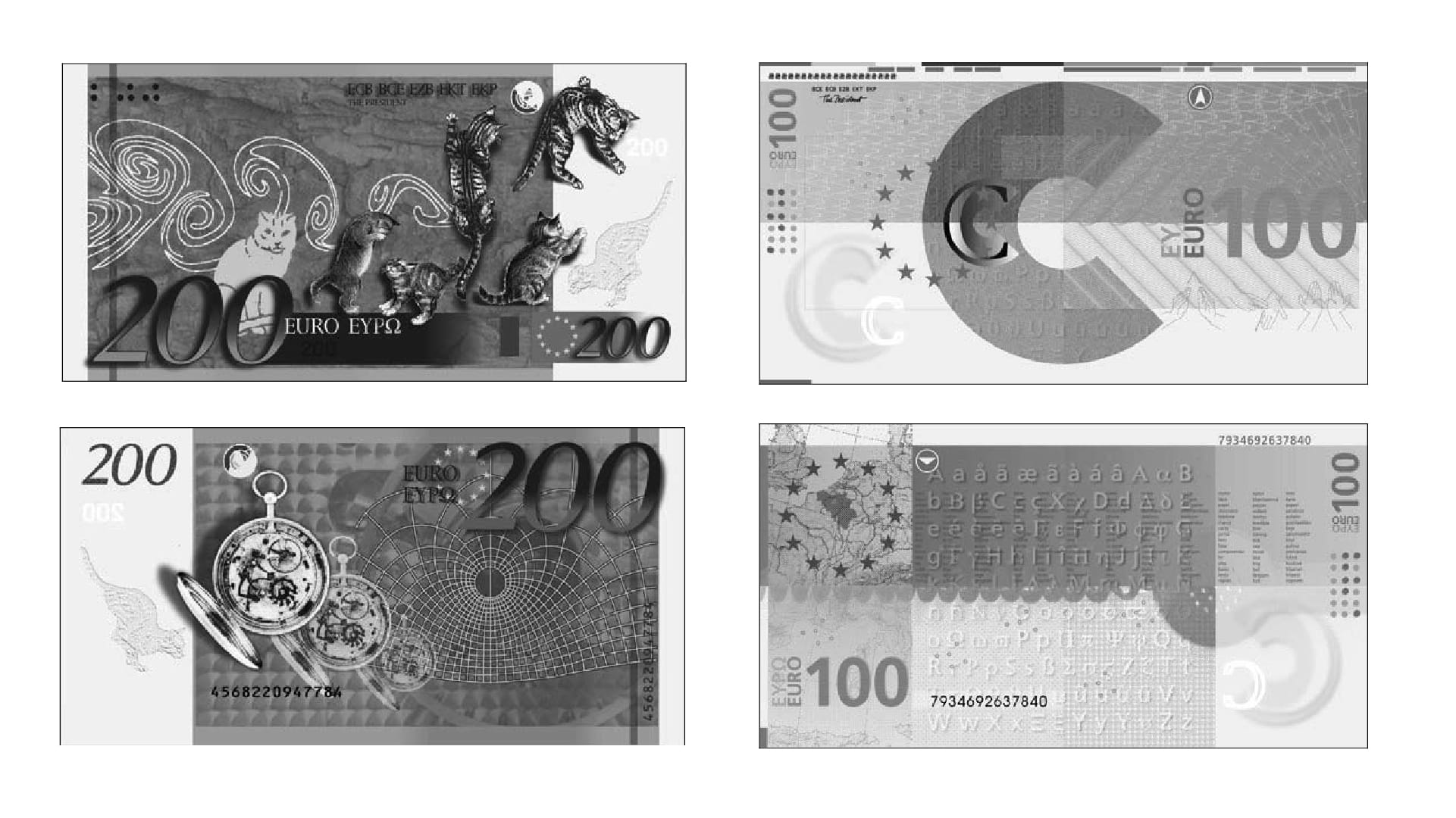
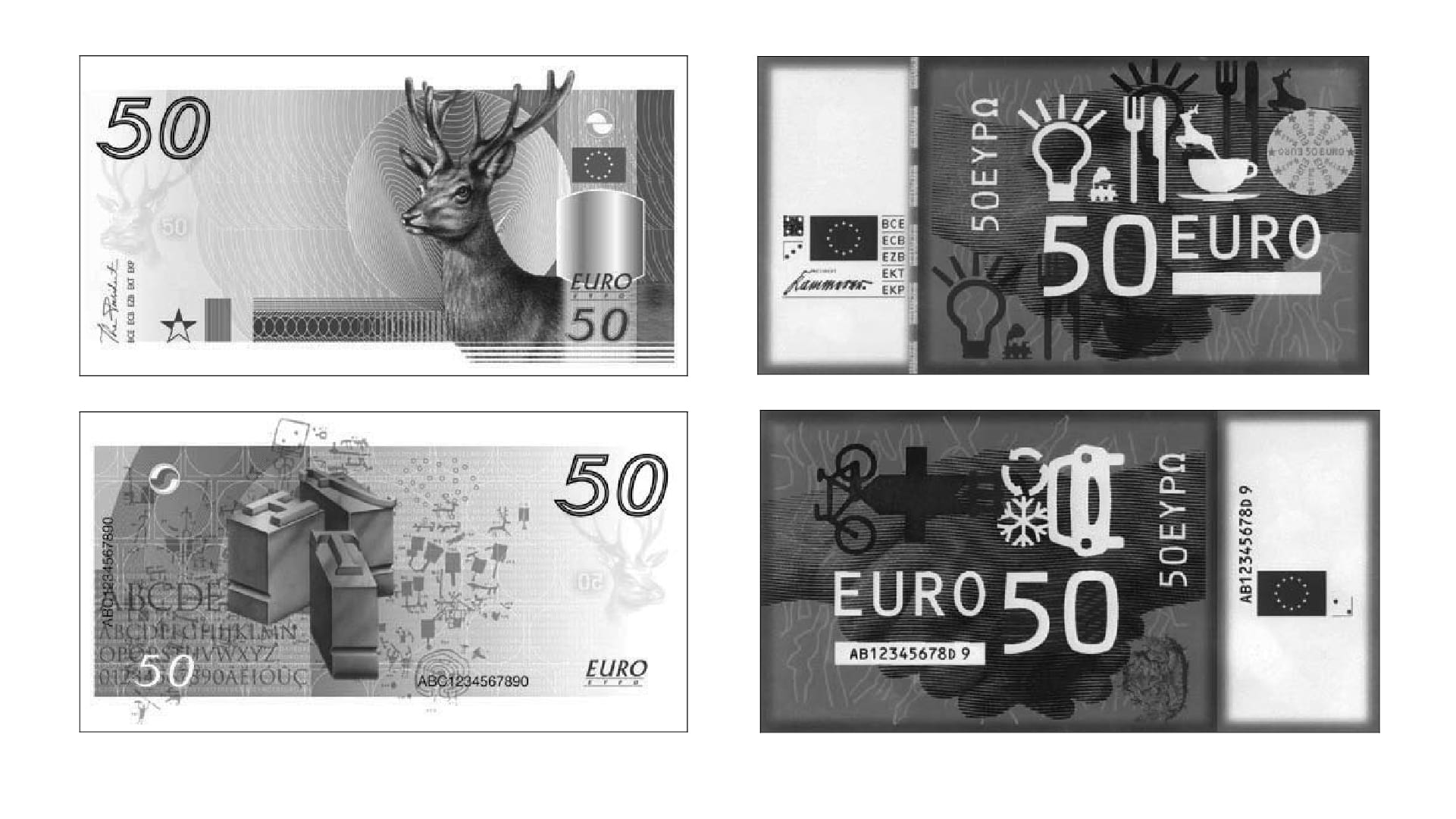
Selection of a few Design Proposals for the first Euro Series. Source: The design of euro banknotes. Drafts and decision processes, Helen Winter. 2007.
A look at the 43 rejected design proposals reveals interesting alternatives how the Euro Banknote might have looked like. From jumping cats to the depiction of writing culture to a very graphical approach using icons.
Bridges of Nowhere – A Supranational Identity based on Fantasy?
The Final Design (Series One and Series Two)
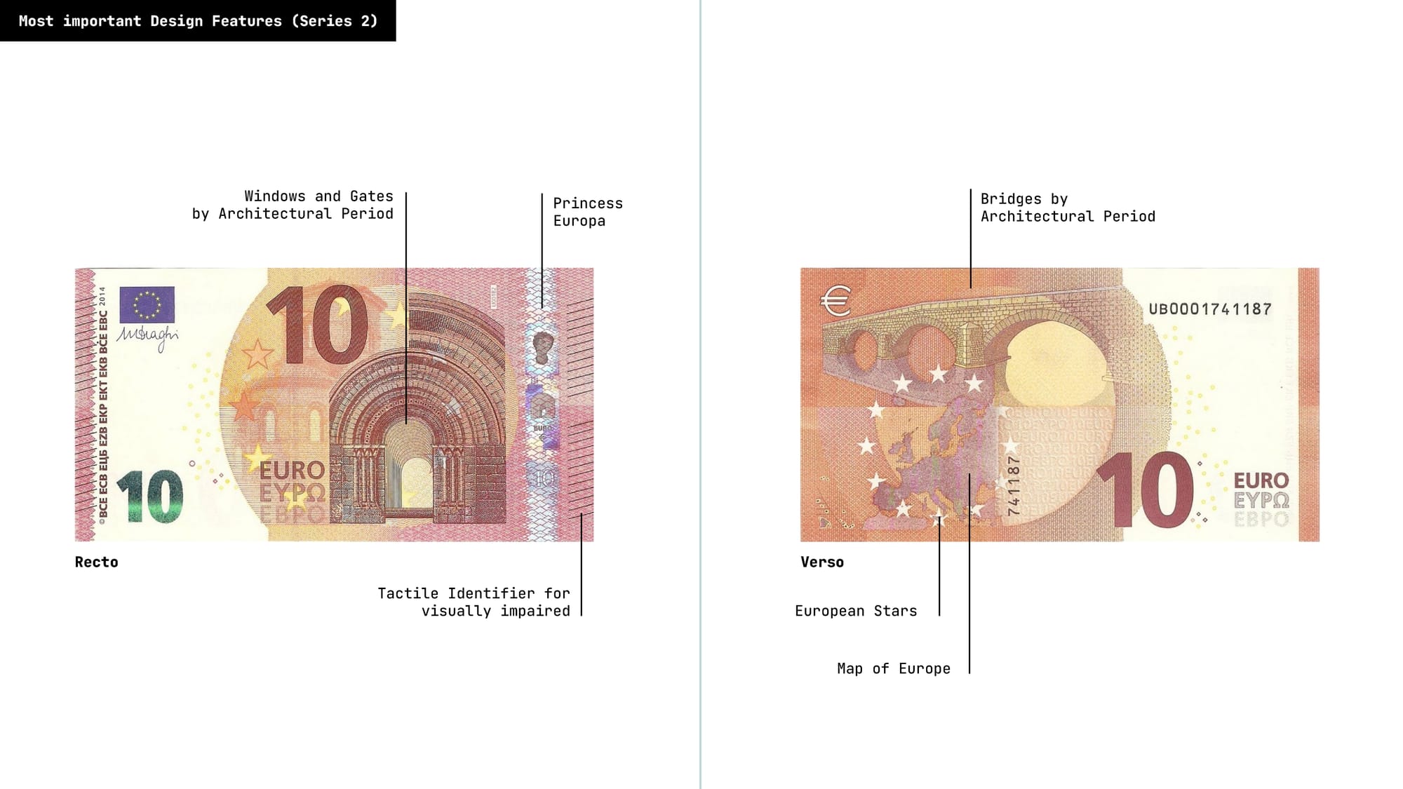
Finally the proposal from Austrian designer Robert Kalina was selected. His proposal depicts gates and windows on the front visualizing »the spirit of openness and cooperation« and bridges on the back showing »the connection between the peoples of Europe and between Europe and the rest of the world.« as main themes. More prominent visual elements are the geographical map of Europe (and North Africa) as well as the Euro Stars and the portrait of the Europa princess.
Before the finalisation of the design began, there were some visual remarques to be addressed: The motifs of bridges, windows and gates had to be made so that they do not resemble real examples, furthermore their design should be physically correct so that – when transferred to the real world – they could bear the weight of traffic.
Since then, 30 billion euro banknotes are circulating with these designs.
In 2013 the initial design called Series 1 was slightly updated in terms of security measure but also in terms of design with Series 2 by designer Reinhold Gerstetter (See Comparison between the Series below).
Bridges without Places – The Main Motif
Since the banknotes do not carry portraits, it's harder to distinguish them from another. That’s why the different colours per denomination are a very prominent design feature. Nobody or only very few people would be able to distinguish them by their buildings in different architectural styles.
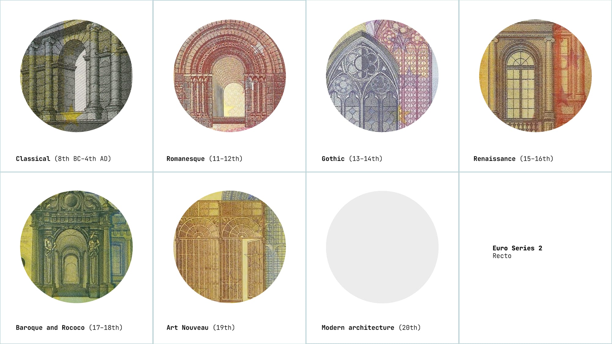
In the redesign from Series 1 to Series 2 the general colour contrast was increased; the illustrations of windows and gates slightly updated.
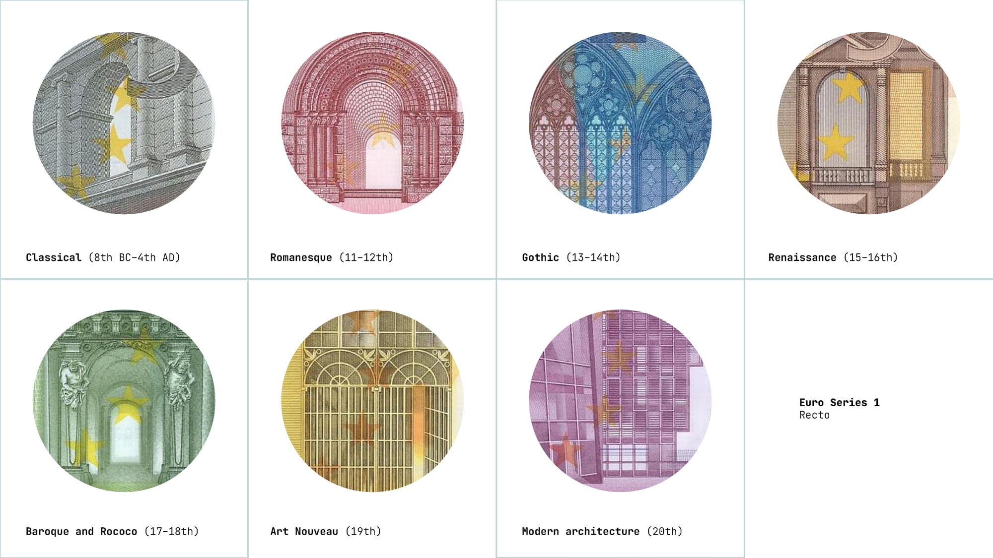
The main motif on the Front (Series 1) showing Windows and Gates through the Epochs. Infographic © Robin Coenen
The most curios thing is that the bridges, the main theme on the backside, do not exist at all. Their fictional character solves the political problem of national representation, but it also produces a strangely placeless Europe. European identity is represented through architectural history while remaining detached from any actual European location.
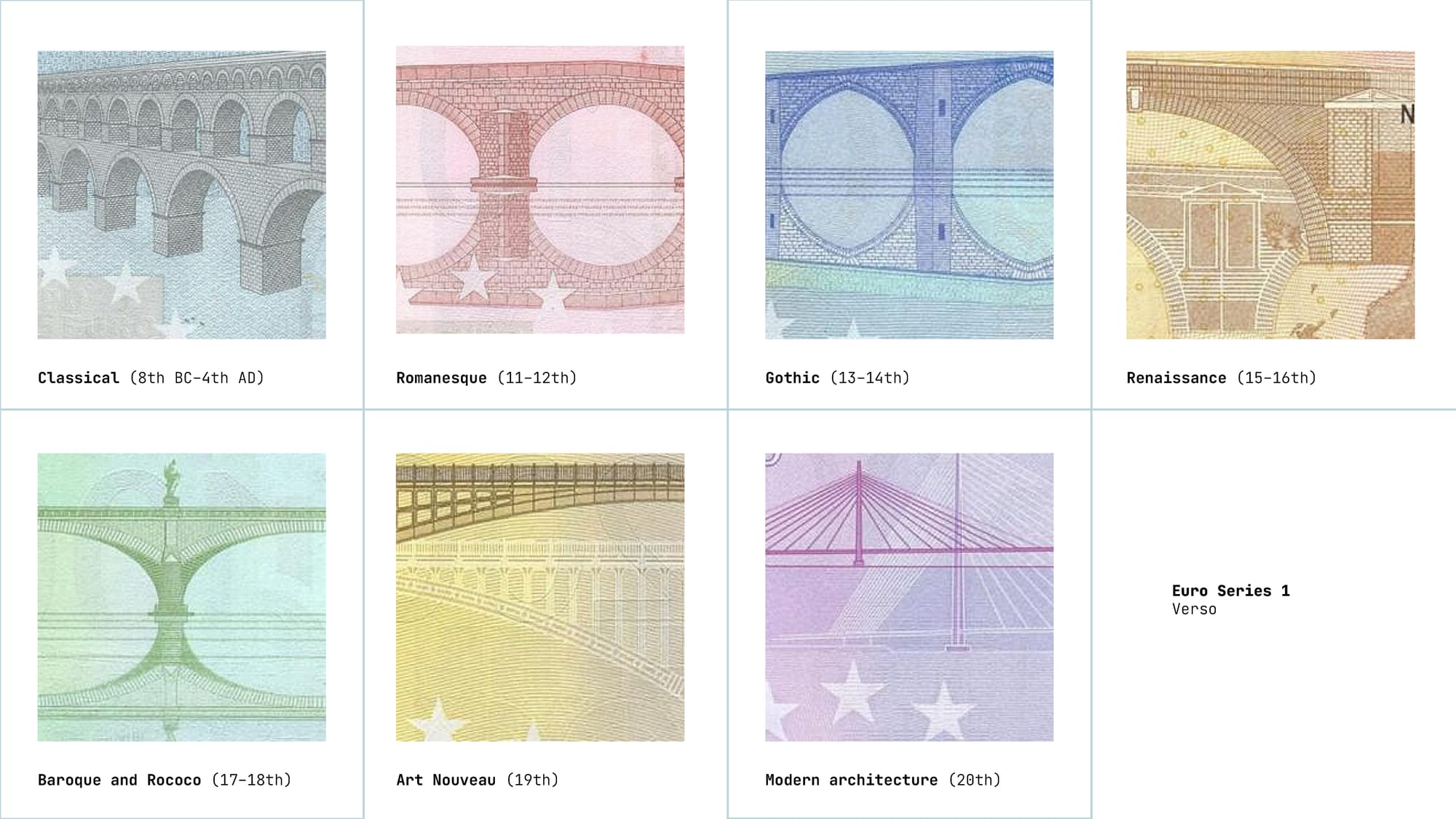
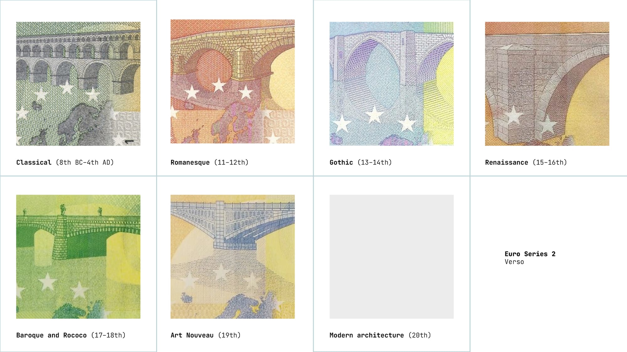
In the redesign from Series 1 to Series 2 , the reflection of each bridge in the water were reduced and all bridges are now illustrated in perspective. Probably to avoid collisions with the map the bridges were slightly scaled down in size.
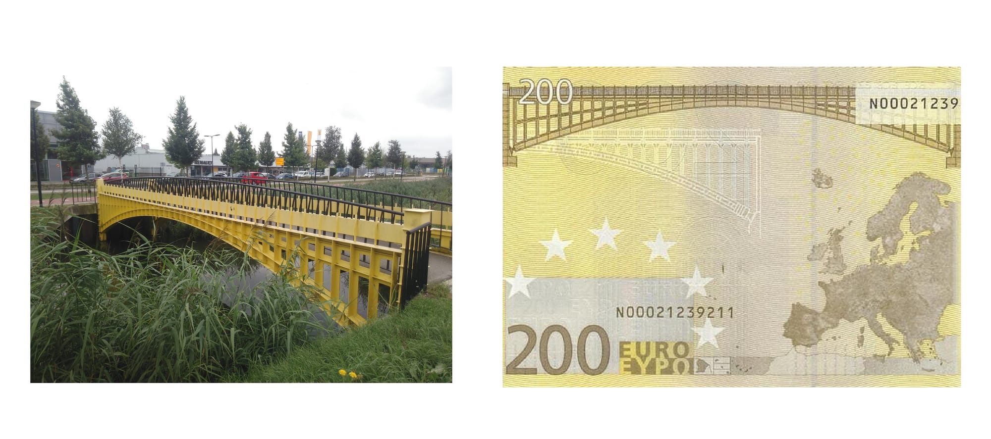
The fact that these bridges were imaginary in order to be neutral of course opened the room for creative ideas. The designer Robin Stam rebuilt all bridges, from the 5€ to the 500€ Banknote, in the city Spijkenisse in the Netherlands.*
European Colonial History in our Pockets – The Map
The visual representation of a map showing (geographical) Europe reportedly sparked many discussions about which projection to use and what to show. Finally it was decided to use Satellite Imagery as a map base; due to technical printing reasons no islands smaller than 400 km2 would be depicted.
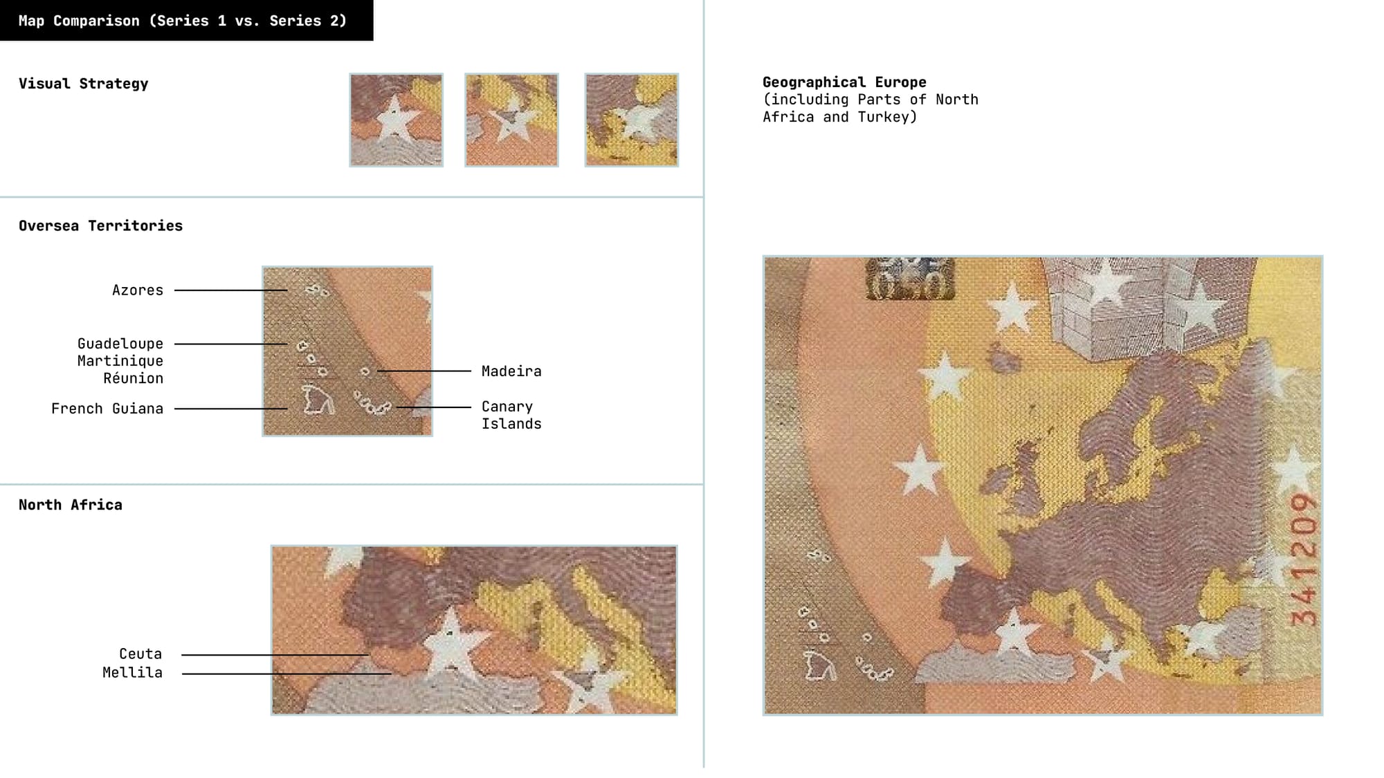
The map also shows part of North Africa, according to the publication How the Euro Became Our Money to include the »Spanish possessions Ceuta and Melilla«. Other Islands or »Overseas Territories« which – due to geographical reasons – were not on the actual map are depicted in a visual addendum on the left side.
The mapmaking process behind the euro banknotes is poorly documented. Some of its design decisions can only be reconstructed through a court judgment of 2024 (the cartographer initially transferred the rights for the equivalent of approximately €2,200 and subsequently sought €5.5 million in additional compensation).
According to the case files, the banknote map was based on a digital image called europa.tif, created by Austrian cartographer Lothar Beckel and his company from numerous satellite images. The material was combined and extensively edited: coastlines, islands and surface structures were adjusted, while colour, shading and relief were added to produce a physical map of Europe.
For the banknotes, this detailed image was then reduced, simplified and transformed into the monochrome map visible on the reverse.
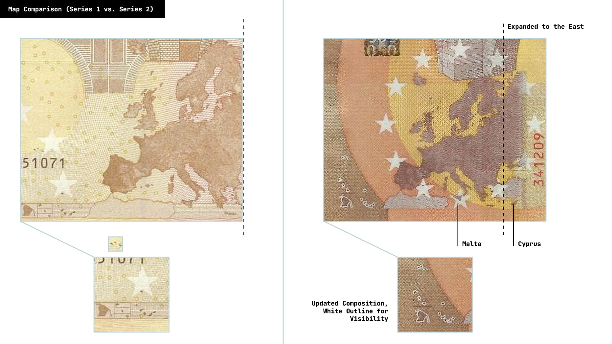
The transition from first (Left Image) to the second (Right Image) banknote series shows a different visual strategy for depicting Europe’s overseas territories. Instead of enclosing them in a rectangle the territories are arranged more freely along the edge of the banknote and outlined in white.
Removing the frame and the outline makes the territories more visible as individual shapes, yet their position at the edge of the banknote continues to present them as geographical additions to Europe rather than as fully integrated parts of its map. The composition reveals the difficulty of representing Europe’s colonial and postcolonial geography within a supposedly neutral image.
Furthermore the whole map in general is expanded eastward to reflect the enlargement of the euro area and now includes Cyprus, which was absent from the first-series design. Malta is likewise shown in the updated map, despite its area being smaller than 400 km². These changes demonstrate that the geographical image of Europe is in flux.
»Design is not important – I don’t use cash in practice, and I think other countries are following this example too.«
— (61+ years old, Lithuania)
The Return of Faces? – The Design of the Euro Series Three
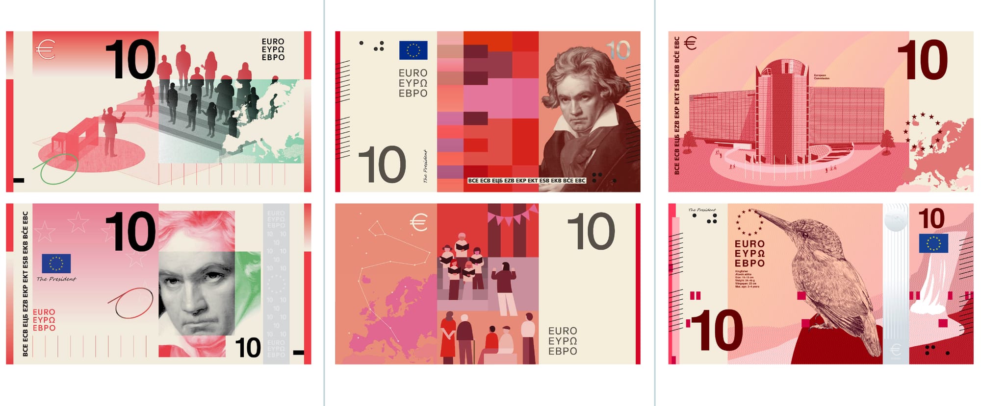
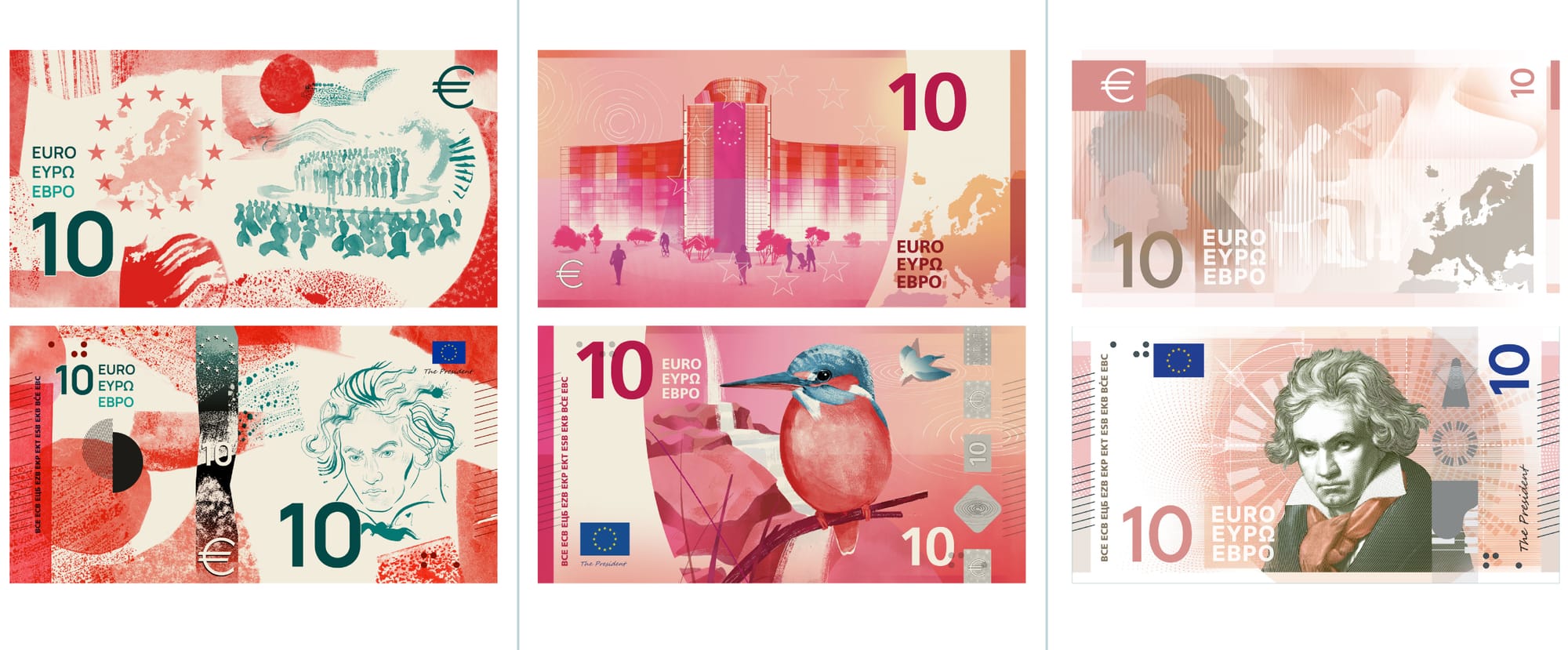
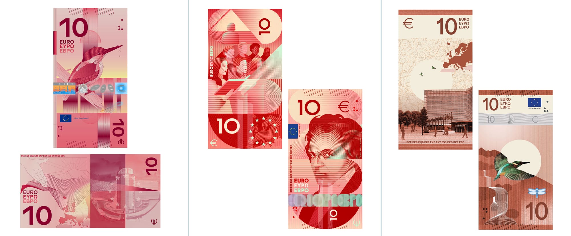
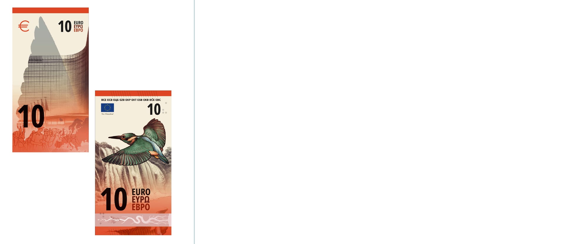
10€ Banknote from shortlisted Designs Proposals in 2026. Designers: Studio Joost Grootens, PunktFormStrich, Neue Gestaltung GmbH, Rudy Guedj and François Girard-Meunier, Myrsini Vardopoulou, Jan Robert Dünnweller, Rubio & del Amo and Cruz más Cruz, Atelier Goppel-Toperngpong, Isabelle Daëron and Ville Tietäväinen. Source: European Central Bank
A third series of Euro banknotes is currently being developed and may enter circulation toward the end of the decade, although no official release date has yet been announced. On 23 July 2026, the ECB presented ten shortlisted design proposals, selected from submissions by 25 invited designers.
»It is nicely neutral with such buildings – better than with famous persons because this could set off debate easily.«
— (26-40 years old, Germany).
In preparation for the redesign, the ECB commissioned several studies and public consultations to narrow down the possible themes and motifs for the third series. An initial qualitative study investigated how Europeans perceive different forms of visual representation on banknotes.
Its results led to a shortlist of seven themes from European Culture; Birds: Free, Resilient, Inspiring to Rivers: The Waters of Life in Europe; or The Future Is Yours; Hands: Together We Build Europe. The qualitative research offers particularly interesting insights into how citizens interpret banknote imagery.
»Illustrations must remain neutral […]. That’s probably why the theme is meaningless.«
— (61+ years old, Belgium)
The seven themes were again evaluated through both an online survey and a representative survey across the euro area. Here European Culture received the strongest support in the representative study, followed by Rivers and Birds. The ECB therefore retained European Culture and combined the two nature-related themes into a second theme, Rivers and Birds.
Sensitive Matters: Navigating the Power of Visual Representations
The euro is now firmly established. What was considered a no-go when the first banknotes were introduced — the depiction of important historical personalities —now seems possible for the third series. The proposed theme European Culture sets six personalities with six scenes of cultural life.
The proposed €10 banknote, for example, depicts Beethoven on the front and »street performers entertaining passers-by through music, dance and theatre« on the reverse.
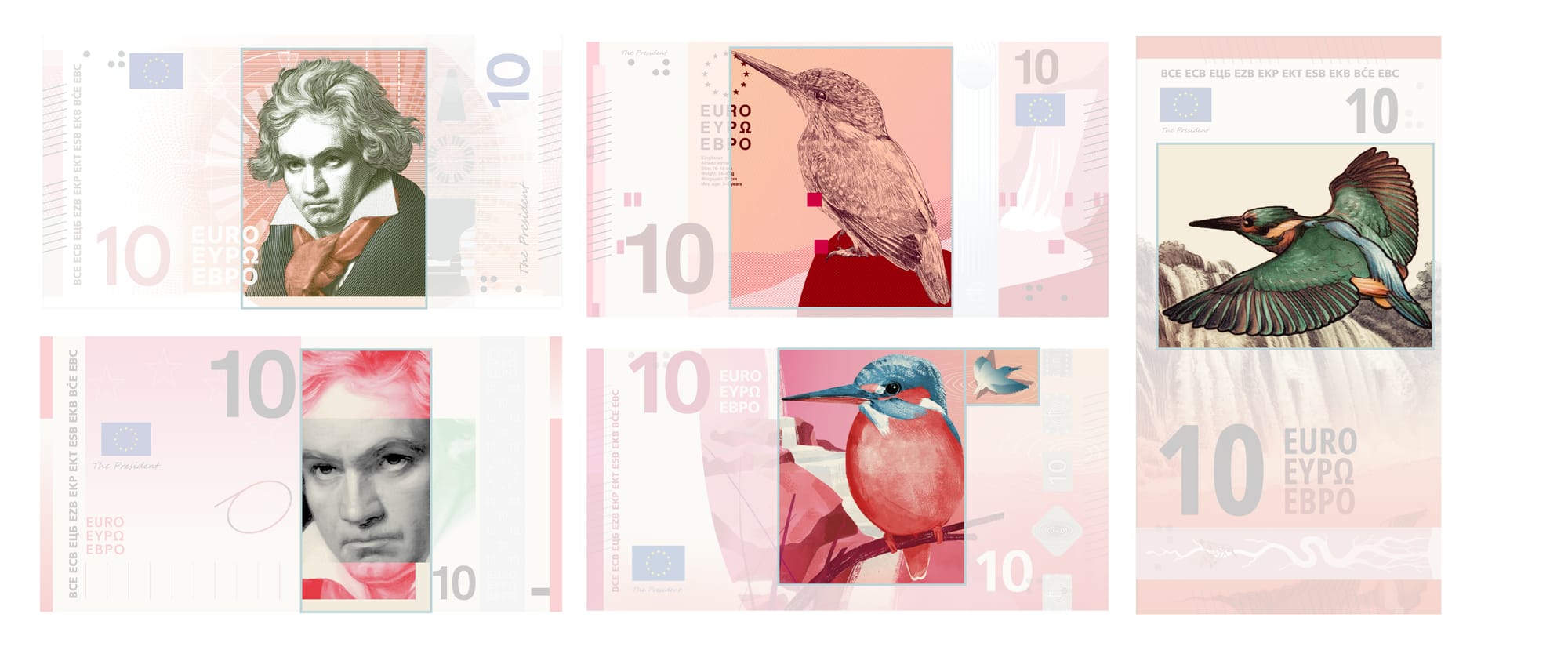
Nevertheless, the selection of historical figures immediately raises questions of national attribution. The proposed depiction of Marie Curie on the €20 banknote for example prompted criticism in Poland because the ECB initially presented her as »Marie Curie (born Skłodowska)«, placing her Polish surname in a secondary position. Polish commentators instead advocated the name Maria Skłodowska-Curie.
The alternative theme, Rivers and Birds, may at first appear more neutral. Yet its connection to the environment is crucial: If Europe and its many member states choose to represent a shared identity through natural elements such as rivers and birds, environmental protection also becomes part of that identity. This symbolism carries a particular weight at a moment when forests in France and Spain are burning and climate change remains the global challenge for the next decades or centuries.
Is Europe prepared to back these symbols with the resources and action required for environmental protection?
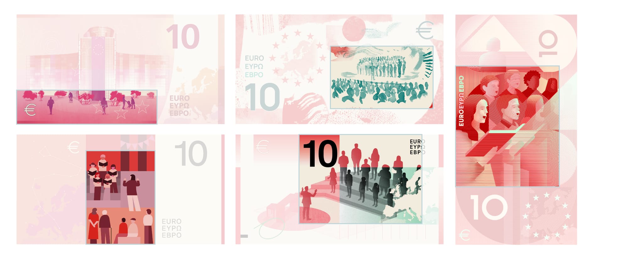
The scenes on the reverse raise further questions:
Representing human beings creates a different kind of complexity. Why are only personalities and activities from the cultural sector depicted? Where are the nurses, construction workers and others who sustain and build European societies? Who is part of our society?
Depicting people always means excluding other people. Certain visual features and social groups can be represented, but gaps inevitably remain.
This visual problem is not new. Another famous example is the plaque sent into space aboard the Pioneer spacecraft in the 1970s, which was intended as a communication measure for a potential extraterrestrial audience. Looking now back at its representation of a man and a woman, it is questionable whether the image can stand for humanity as a whole.
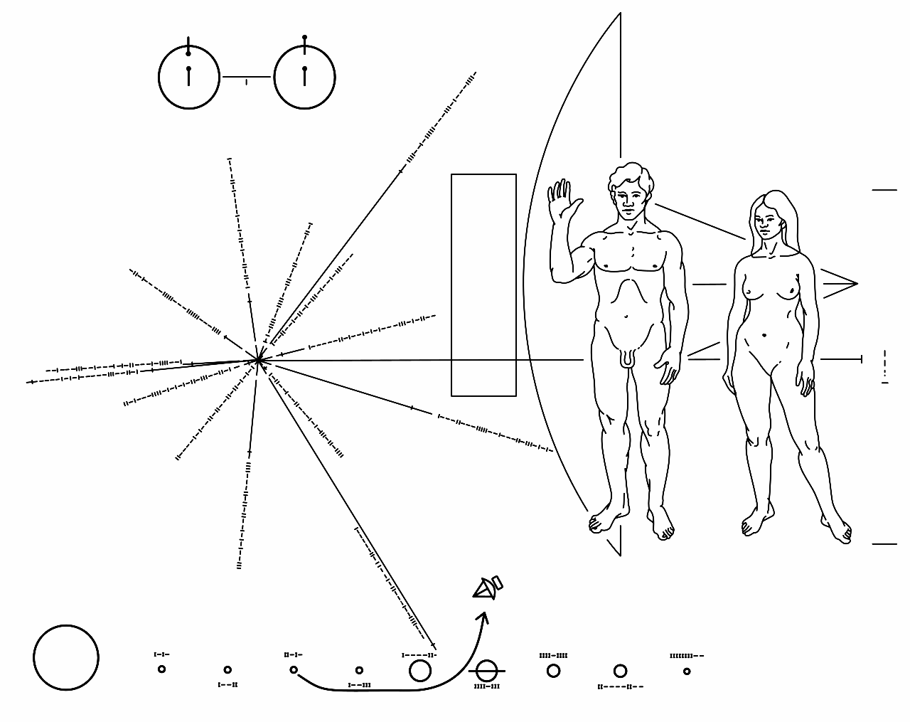
Why is only male genital part depicted? Why does the man stand in front of the woman? Why is he the one raising his hand?
Like a banknote, the plaque attempts to compress a complex and diverse population into a single supposedly universal image.
Allowing Visual Complexity on a Banknote
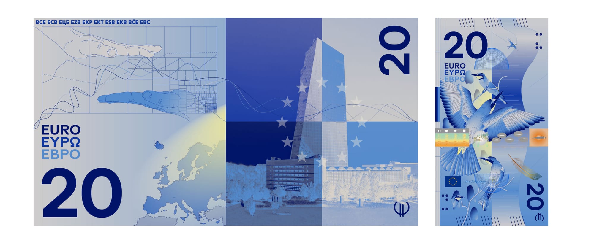
My favourite design proposal is designed by Rudy Guedj and François Girard-Meunier. It avoids the direct visual representation of human beings by showing only hands — debating, holding and working together. In this way, human activity is represented without assigning Europe a specific face or nationality. (The gender question probably remains.)
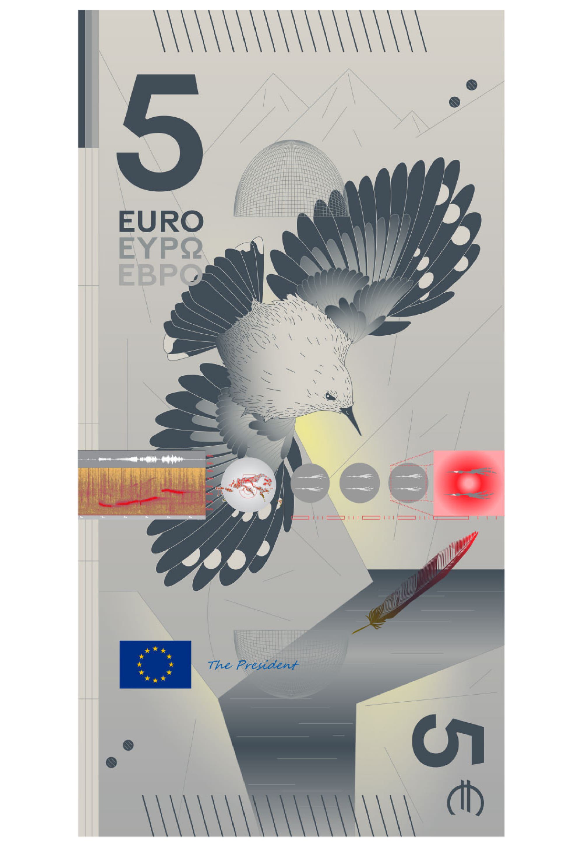
The depiction of birds and rivers on the reverse takes a very scientific approach. A vertical bar indicates the flight speed of each bird, while additional infographics visualise its call as a sonogram, global migration routes in a circle and footprints. Even the shape and size of the birds eggs is visualised.
Rather than using nature merely as decoration, the design invites a closer and more informed view of the natural world — and of what needs to be protected.
The circle showing the migration routes of the birds is also significant.
It is the only proposal in which a cartographic representation is not limited to Europe alone. Instead, it – at least very subtly– suggests that Europe is part of a globally interconnected world, crossed by species, movements and ecological systems.
European processes take time — and, as we learned, do not always lead where expected. For now, however, the future appearance of the euro remains open.
You can even help shape it by voting for your preferred design until the end of September.
*Update 20.09.26: If you want to dive deeper into the topic of the Bridges read this Article by Russ Swan. Thanks to Francois Girard Meuner for the hint.
Further Reading in the Sight Regimes Series:
 Robin Coenen
 Robin Coenen