The Soviet Map Distortion Policy — Sight Regimes I
Sight regimes work not by telling us what to see, but by deciding what will appear true. In the Soviet Union, decades of map distortions embedded false geographies into the fabric of official design, turning cartography into an instrument of perception management and state security.

Somewhere in a provincial classroom in 1970s Gujareti, a student stands in front of the class and points to a map of the Soviet Union mounted right beside the blackboard. It is a large laminated 16-panel folded map, probably printed in warm reds and beige tones or similiar colors. The rivers might be coded in blue, mountain ranges shaded in soft brown contours and the cities marked with black contoured circles. The USSR, spanning over 22 million square kilometers and eleven time zones is –at the time of the photograph– vast, ordered and whole.

What probably no one in this classroom knows is that this map, along with many others, — if not all other public maps in the USSR at that time, does not depict reality. In fact: It has been deliberately altered. Dozens of cities have been shifted from their actual locations. Military zones have been removed entirely. Roads bend to nowhere. Certain coastlines, if compared to earlier map editions, no longer align. The distortions are not directly visible because they were never meant to be noticed.
This was not the work of typical political propaganda in the traditional sense; there were no slogans, no heroic figures, no promises at work. Instead, this map is the product of a more sophisticated operation:
The slow reconfiguration of geographical visual representations through adjustments at the level of data, layout, and projection.
The Mapmakers’ Map
In order to understand that operation, it is important to see this classroom map — a proxy for all other maps of the time — not as a beautiful cartographic craft of symbols, colors, and lines, but as the final product of an entire bureaucratic machine.
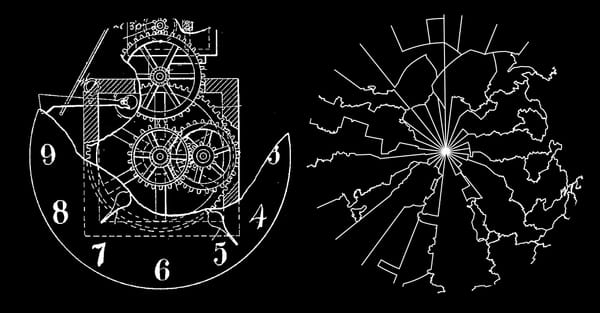
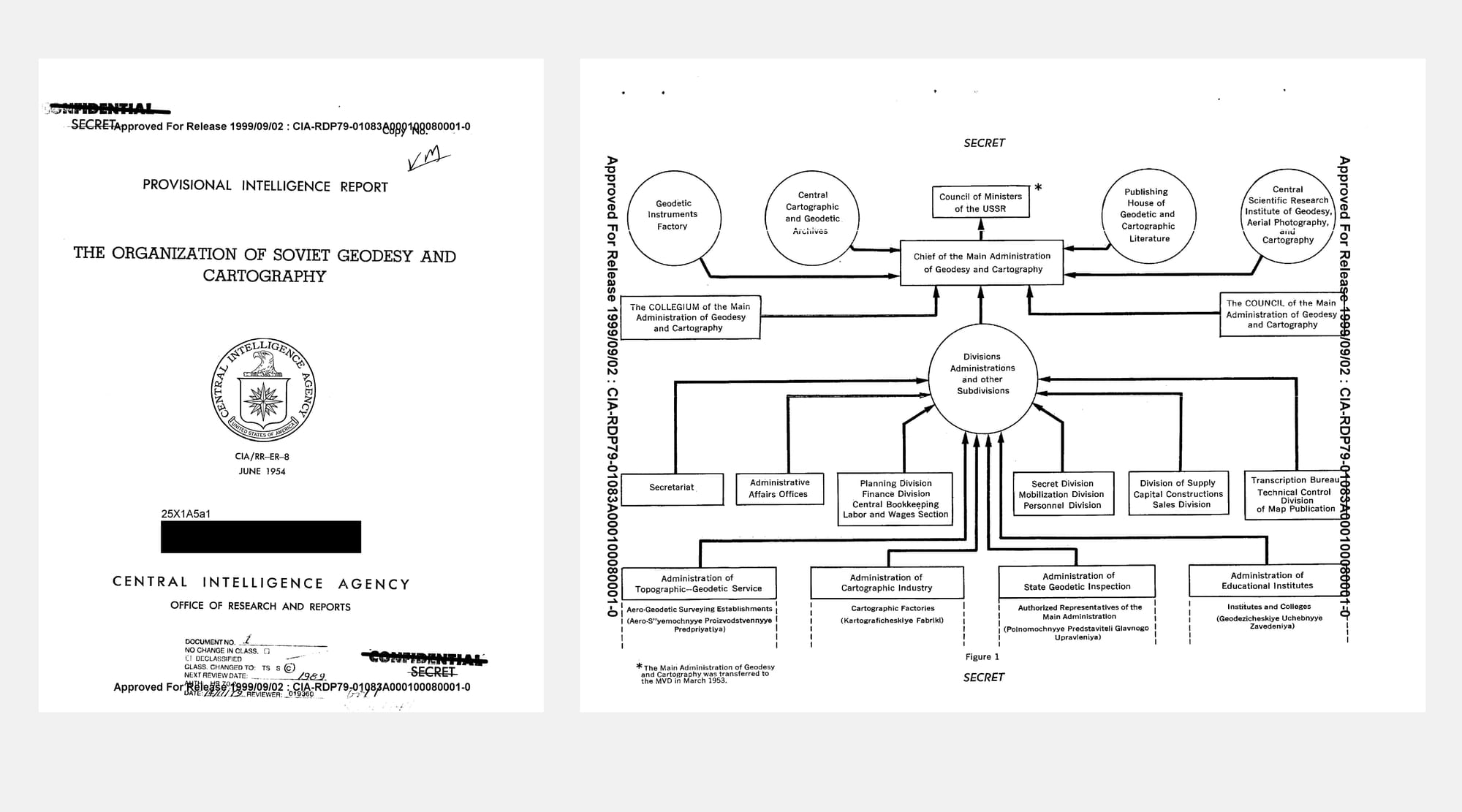
A 70 pages strong report published in 1954 by the CIA (and declassified in 1999 for the public), titled The Organization of Soviet Geodesy and Cartography, ends with an organigram of the Soviet cartographic system that makes the scale of that machine visible: It shows sixteen divisions or departments reporting to two overseeing bodies; the Main Administration and the Council of Ministers. But in the lower margin, almost invisible, an asterisk annotates the diagram:
»*The Main Administration of Geodesy and Cartography was transferred to the the MVD in March 1953.«
The Ministry of Internal Affairs, or MVD, was not a technical agency. It was the Soviet Union’s internal security service, overseeing for example the domestic police, border troops, and prison administration. March 1953 was the month Stalin died. Beria, then head of the MVD, briefly consolidated extraordinary powers. For cartography, this transfer meant that maps were no longer simply scientific instruments or public goods for orientation; they had become state security assets. The design of maps had entered the realm of internal security. In retrospect, this 1953–54 transfer could be seen as a first, faint indicator of the Map Distortion Policy that would follow shortly after.
The Soviet Map Distortion Policy
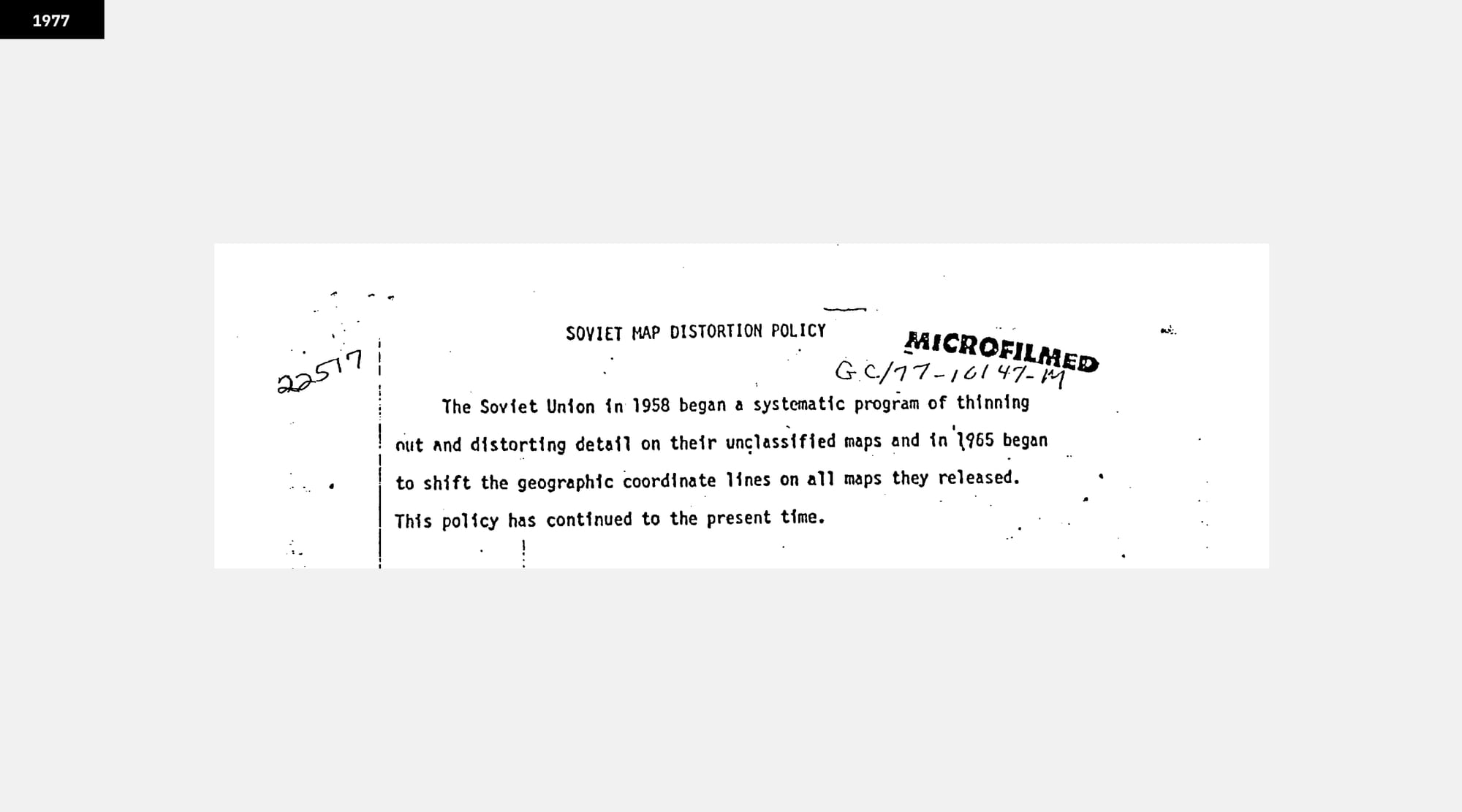
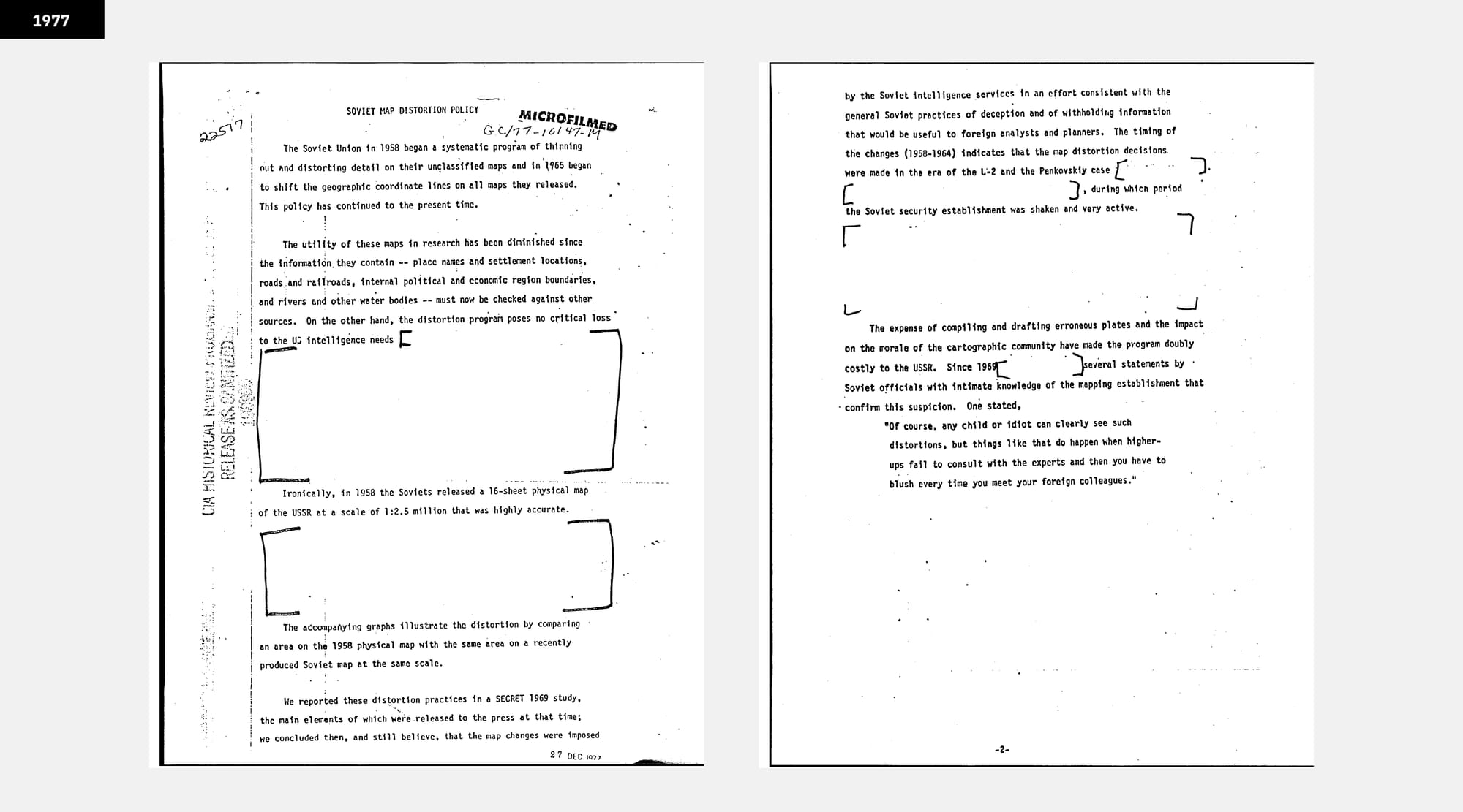
CIA Report called »Soviet Map Distortion Policy« from 1977 (Source: www.cia.gov)
»The Soviet Union in 1958 began a systematic program of thinning out and distorting detail on their unclassified maps and in 1958 began to shift the geographic coordinate lines on all maps they released. «
This is how an internal assessment titled Soviet Map Distortion Policy, published in 1977 by the CIA, opens. The memo outlines the very system in which every publicly released Soviet map was to be treated as a potential leak to be preemptively falsified. It was not a matter of one-off redactions — the distortions were constantly baked into the production process. For the casual user — a geography student, a bus passenger — the edits were invisible, concealed beneath the surface precision of professional cartography. According to later accounts, these alterations included shifting rivers, railroads or towns by up to 25 miles. Even public maps with very low granularity (40 miles to the inch) were distorted.
By the time the CIA wrote this report, the practice had been in place for nearly two decades. The memo also points back to an earlier classified study completed in 1969, which was subsequently summarized and — at least in part — released for public consumption. That release appears to have provided the basis for the first public hints in the Western press that Soviet cartography might not match reality.
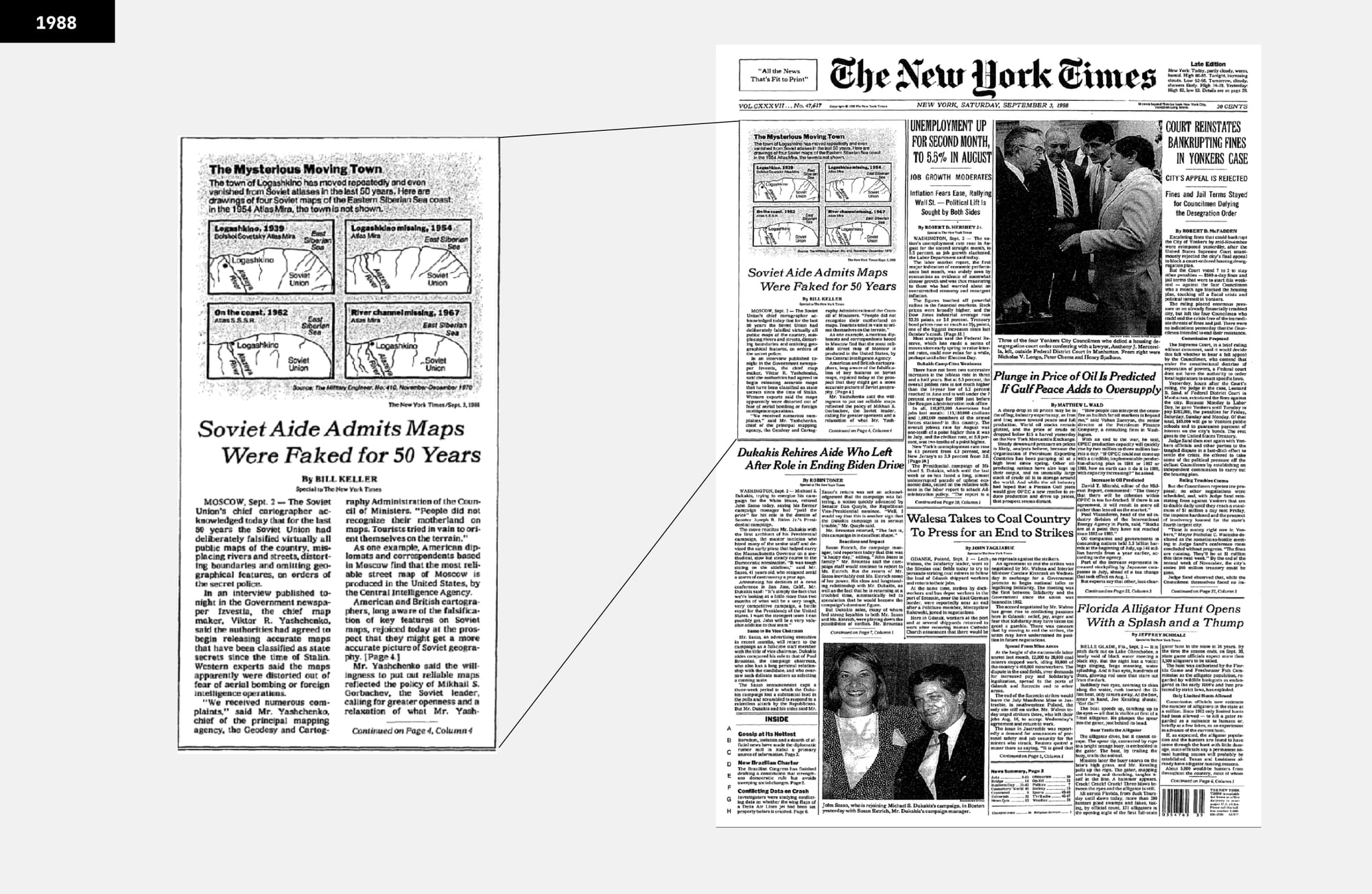
The Distortions Break Cover
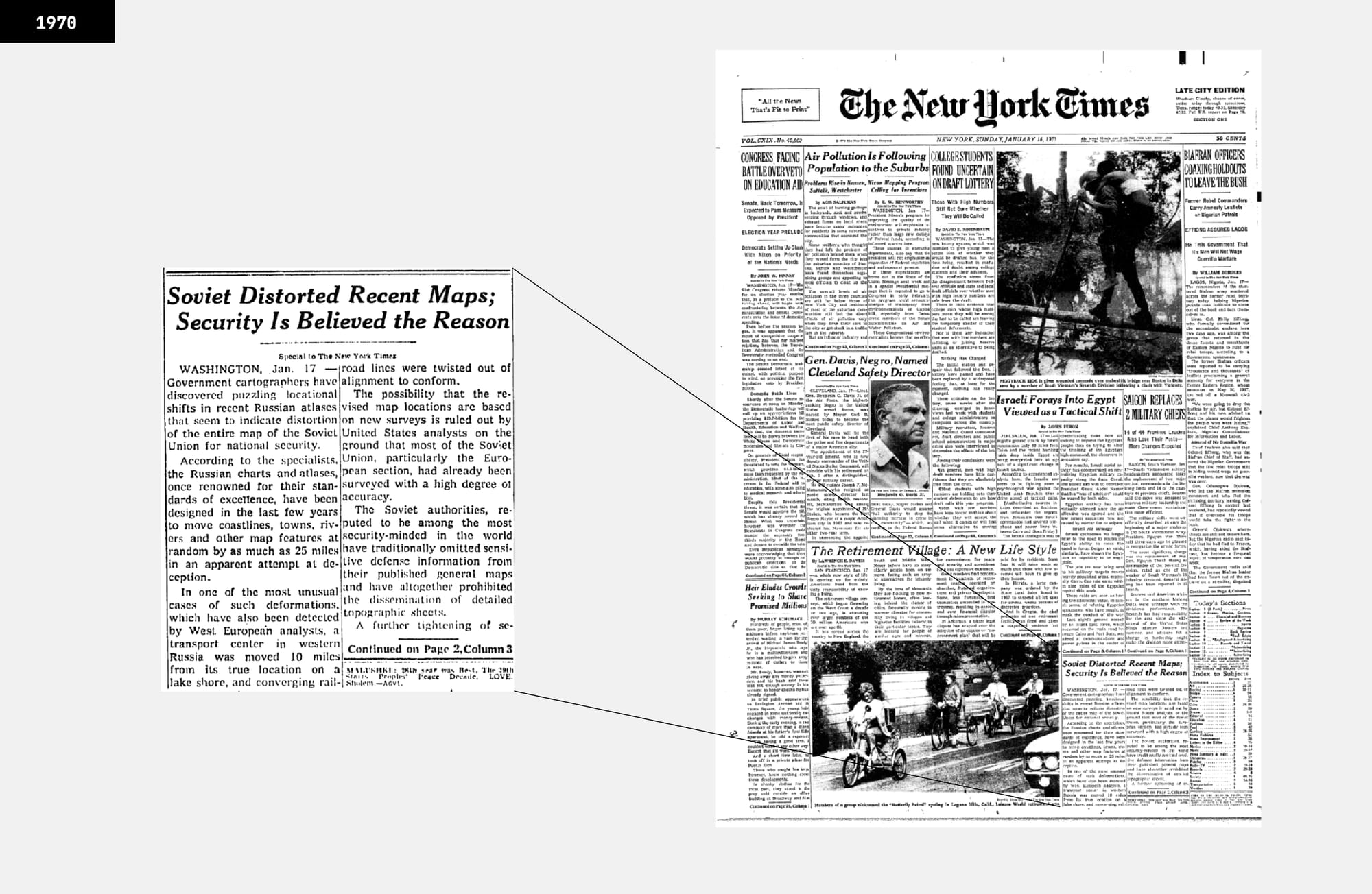
In January 1970 The New York Times ran a short piece noting that Western cartographers had found »inexplicable« errors in Soviet maps. The article’s tone was speculative, but the suspicion was clear: these were not printing mistakes. Eighteen years later, in May 1988, the paper returned to the subject. This time, the source was not a western analyst but the Soviet authorities themselves, who acknowledged, almost offhandedly, that for decades »all maps made for public use have been intentionally altered for reasons of state security.« The admission, printed in Izvestia and quoted in the Times, confirmed what Western intelligence had long believed: The Map Distortion Policy, probably one of the biggest graphical schemes in action, was true.
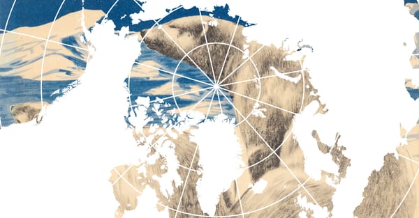
Overlaying Fictions
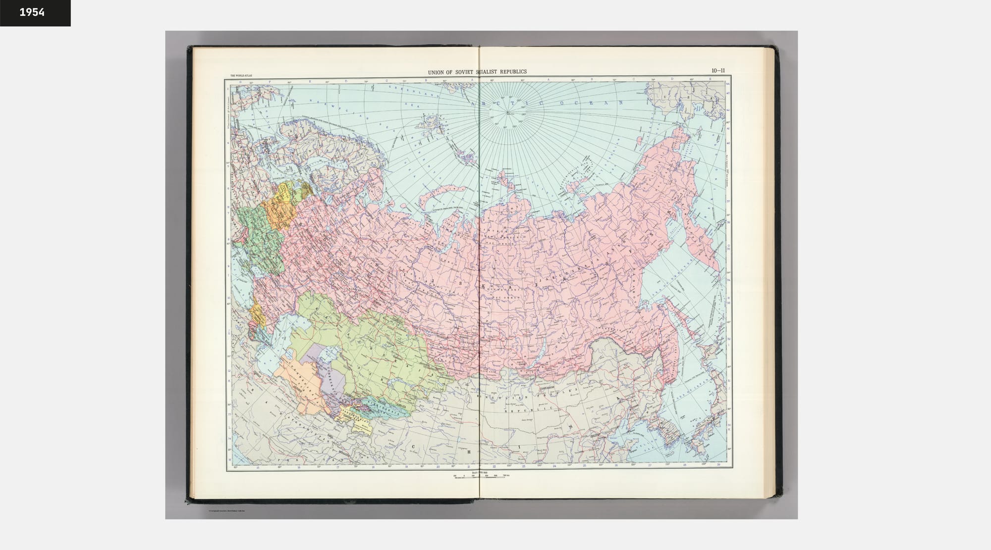
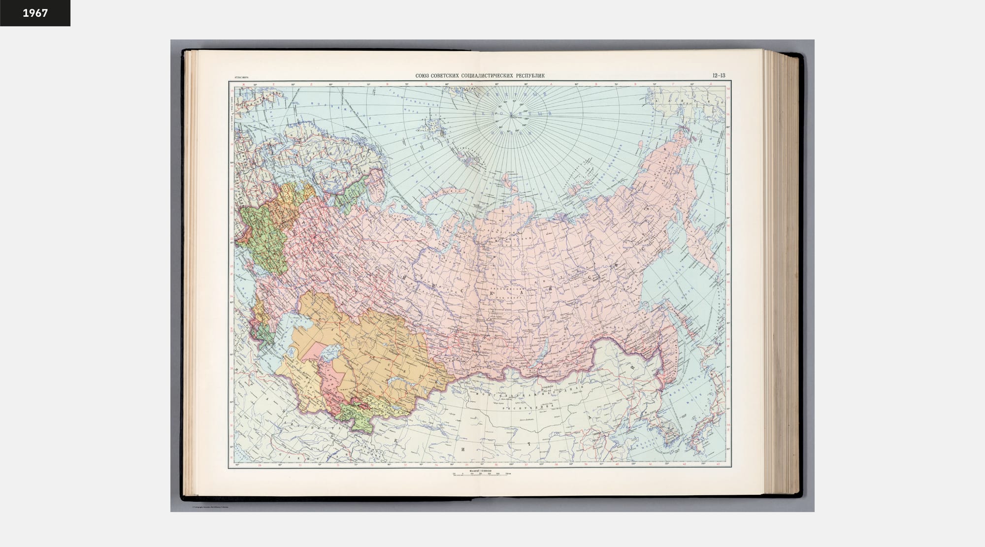
Left: First World Atlas Edition from 1954, Right: Second World Atlas Edition from 1964. (Source: www.davidrumsey.com)
When looking for a proxy to verify the extent of these distortions, the Atlas Mira (translated: Atlas of the World) is a near-ideal source. Produced to high design standards and widely distributed in the Soviet Union, it represents the official cartographic image presented to the public. Two editions available at the David Rumsey Digital Collection — one from 1954 and another from 1967 — offer a rare, directly comparable set of materials.
The 1967 edition is particularly notable for including both English and Cyrillic place names. Unfortunately, the digital scan of this edition shows a slightly misaligned page layout caused by the scanning process, introducing a minor positional shift that is mechanical rather than cartographic. Even so, it is possible to watch the distortion policy at work. When the eastern hemisphere is overlaid, the contours of the North American coastline align almost perfectly, while the Russian coastline shifts noticeably.
On further inspection, the granularity in the second edition appears coarser than in the earlier edition. Some cities leap several miles from their original position; rivers change course or terminate in different locations.
What was not revealed in articles or declassified reports, is the design process behind these changes. Were coastlines redrawn correctly first and later distorted? How were the random position shifts of cities decided? Did the distortion proceed region by region? These experiments of overlays capture only the final products, while the steps that led to it remain hidden inside the Soviet cartographic apparatus.
The Regime of Distorted Sight
However the design process looked, what sustained the Soviet Map Distortion program was the authority of its design. The maps looked right. Every symbol sat on the grid with the confidence of measurement. Design has this peculiar power: it projects the visual language of truth.
As Richard Saul Wurman observed in his book »Information Anxiety«, the visual quality of visual (re)presentation can quiet doubts — viewers will assume the fault is in their wrong understanding or reading, not in the data or design. By folding distortion into the cartographic process itself, the Soviet state could replace reality without disturbing that aura. This is an essence of a Sight Regime: not the loud declaration of what must be seen, but the silent, infrastructural editing of what will be taken for granted as true.
Even after the distortions were exposed, the aesthetic they established — the authoritative look of an »official« map — endures to this day. Maps such as the Atlas Mira still project accuracy, even when the underlying geography is wrong; Reminding us that in (information) design, the most convincing fictions are drawn to the highest standards.