Equal Earth, Triple Earth, Spaceship Earth — Re:port 002
This Re:port explores the ongoing search for better ways to represent our globe on flat surfaces (most recently with the Tri Global Projection) and highlights global datasets that caught my eye — from historical CO₂ emissions to the hidden web of submarine cables.

Latest in the News
In recent weeks, two NGOs launched the campaign »Correct the Map«, urging institutions to adopt the Equal Earth projection as a better alternative to the Mercator projection. The African Union has now voiced its support — a remarkable gesture from representatives of a continent that has long been visually diminished in much of the (western) cartographic tradition. Unlike Mercator, which usually inflates Europe and North America while shrinking Africa, Equal Earth preserves relative land areas while still offering a familiar perspective.
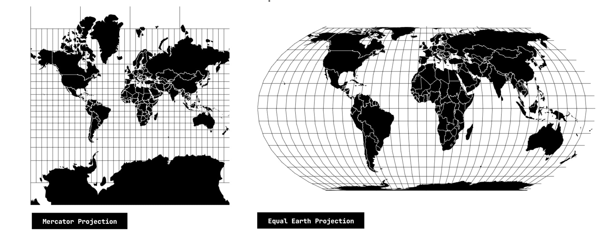
The debate about which map projection represents the world best, is a reminder that the quest for a »right« map (projection) is a never-ending one. Mercator’s original strength was navigation at sea (due to its preservation of angles) — which tied it directly to seafaring, imperial expansion, and colonialism. Beyond its specific context, however, no projection can ever be »wrong«, as long as its underlying mathematics and calculations are correct.
The real challenge is to think critically about visual representation: what story a map tells, what context it serves, and which data it seeks to highlight. The choice of projection should stem from these considerations, if it doesn’t, the result is a »wrong« map.
Readings and Data Sets of the Month
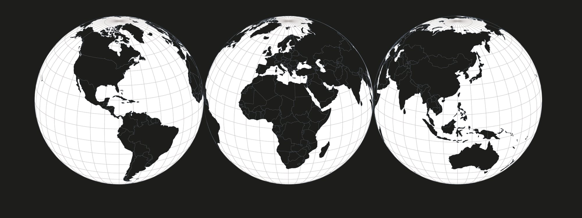
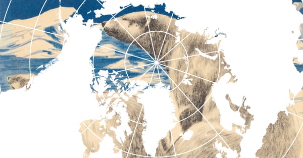
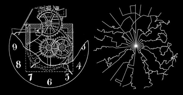
One of the most intriguing projection proposals I came across recently is the »Tri Global« Projection by Vincent Capdepuy (published in August 2025, but it seems the initial idea dates back to 2009), which unfolds Earth into three interconnected globes. Unlike traditional projections that try to compress the planet into a single rectangle or oval, this approach embraces complexity: Since one globe can never display more than half of Earth’s surface, using three allows for broader coverage — even if that means some regions are shown more than once. This redundancy is intentional; it reinforces connections rather than hiding them.
The three globes are centered on key axes of human activity and landmass distribution (Capdepuy proposes the Americas [80° W / 20° N], Europe–Africa [20° E / 20° N], and Asia–Australasia [120° E / 20° N]). Together, they create a multi-perspective view on the planet, rather than privileging any single perspective. Capdepuy points to iconic images such as the »Blue Marble« (1972), which helped spark a planetary consciousness by revealing our shared home as small, fragile, and whole – through one single photograph. For me, this also evokes the spirit of the Whole Earth Catalog and Buckminster Fuller’s idea of »Spaceship Earth« — reminders that how we represent the planet shapes how we imagine living together on it.
Datasets of the Month
Projections like the Tri Global really come alive when paired with global phenomena — patterns that span continents and oceans. Two datasets struck me as especially powerful in this regard:
Seeing this visualization of global CO₂ emissions over time makes one thing clear on first sight: environmental protection is also a question of environmental justice. The early waves of industrialization — and with this the majority of historic emissions — came from the »Global North«. Many countries in the »Global South« only began contributing significantly much later, yet they are among the most vulnerable to the effects of climate change.
A technical note: I did not spend extensive time debugging the data join between emissions records and country geometries. Countries shown in black either have no available data or no matching counterpart in the dataset.)
Video of interactive Visualization made by the Author using the Global Carbon Project Data and Mapbox. (©Robin Coenen)

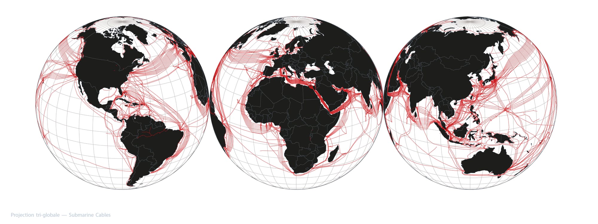
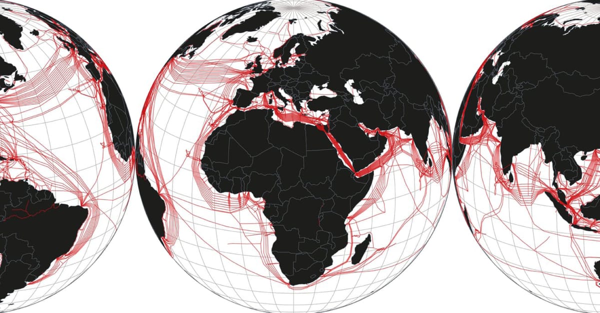
Anyone who followed the news last year will be sensitive to just how vulnerable our undersea cable networks are. In recent months, a series of sabotage incidents in the Baltic Sea underscored the fragility of this digital backbone.
Visualized through the Tri Global Projection, these networks reveal not just their technical reach but also their geopolitical weight. The projection’s overlaps and repetitions mirror the nature of global connectivity itself: fragile threads stretched across seabeds, binding continents together — unevenly, and never outside the realm of politics.
Hope you enjoyed this Re:port. Write me if you have any feedback or check out the most recent Essay on Re:connaissance, if you haven't already: