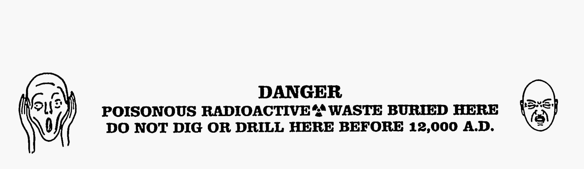
Between Deterrence and Storytelling: Visual Strategies at the Edge of Deep Time
In the early 1990s, two teams were tasked with designing a warning meant to last ten thousand years. One pursued deterrence through design, the other knowledge transfer through storytelling and astronomy. Their split reveals different visual strategies at the edge of deep time.

Jo and Steve bumped along comfortably as Jo steered the drilling rig over the undulating desert terrain. The sun was just up over the horizon, but the day had not yet grown hot.
Steve checked the computer screen.
From the air, the place looked like a series of lightning bolts streaking away from an empty center.
“We ought to be in sight by now,” he said.
“Let’s take another look at that aerial,” said Jo.
Steve brought it up on the screen. Jo stopped to give it a good look. From the air, the place looked like a series of lightning bolts streaking away from an empty center. The center was also where Remote said they got a very strong, but unrecognizable, signal on their recent survey.
“Strange,” commented Steve. “It sure doesn’t look natural."
They drew closer, and Jo swung the rig so it followed the winding path between two hills. She hit the brakes hard, and the two of them snapped against the belts. Blocking their way was a rock. It was right in the middle of the path and the rig couldn’t fit around it. Steve hopped out and looked around.
“Well, I’ll be,” he said, “It’s not rock! It’s some kind of concrete!”
He followed the shape around and disappeared for a few minutes. His head poked out from behind the shape. ‘Jo’ he hollered, “Come and look at this!”
There were faces, two of them. And there was writing, in many different forms.
Jo climbed down and walked over, the sand squeaking beneath her boots. She followed Steve’s head around the shape, only to find another shape behind it. [...] She stood next to Steve and looked. There were faces, two of them. And there was writing, in many different forms.
“Hey, I think that’s Chinese – I saw something like it in my ancient history class,” said Steve as he knelt to get a closer look.
From Warning to Deep Time Communication – The Sandia Report
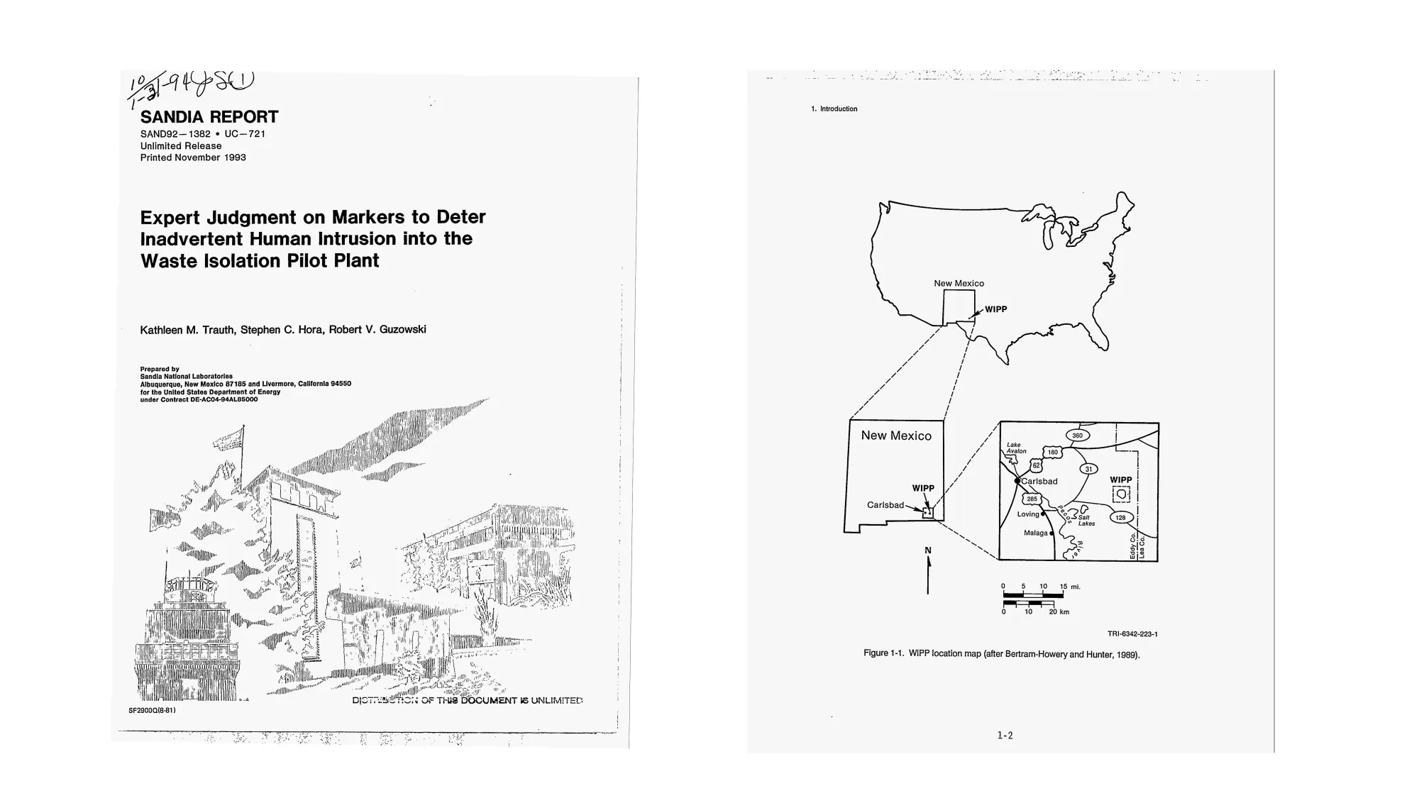
What reads like the opening of a science-fiction novel is, in fact, copied from a scenario embedded in the Appendix F of a 300-page report titled Expert Judgment on Markers to Deter Inadvertent Human Intrusion into the Waste Isolation Pilot Plant (Fig. 1), produced at the Sandia National Laboratories. The story of Jo and Steve – their slow approach through the desert, the geometry glimpsed from above, the concrete slab blocking their way, the faces carved into stone – was written in 1993 as part of a real expert judgement study, using fiction to stage and probe the proposed marker designs themselves.
The study was commissioned by the U.S. Department of Energy (DOE) for the Waste Isolation Pilot Plant, short form WIPP (Fig. 2 ), a geological repository in New Mexico intended to store radioactive waste.
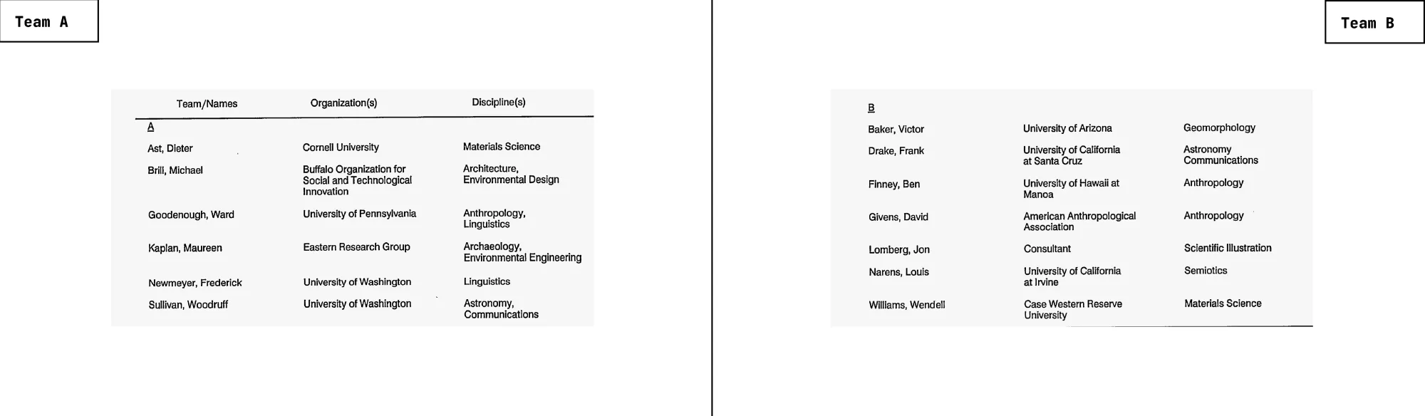
For the study, Sandia assembled two multidisciplinary teams and asked them to work independently. Team A had mostly a background in materials science, architecture, environmental design, anthropology, linguistics, archaeology, environmental engineering, and astronomy. Team B brought together expertise in geomorphology, astronomy, communications, anthropology, scientific illustration, semiotics, and materials science (Fig. 3).
The Briefing
Both teams worked from the same brief: Their task was to propose a marking system that could warn people ten thousand years from now of the toxic danger buried at the Waste Isolation Pilot Plant. The system had to withstand erosion, vandalism, political change, and technological collapse. Furthermore it had to be readable without assuming any shared language, script, or cultural continuity. Lastly it had to convey not only that the site was hazardous, but that the hazard would persist for timescales far beyond ordinary human memory.
To create comparable proposals, the teams were required to accept several baseline assumptions. These included that languages would drift or disappear; that future visitors might have no knowledge of twentieth-century or any symbols for that matter; that the physical landscape could shift; and that the site might be approached by people with no institutional context or historical record.
What can be designed to remain meaningful when almost everything familiar has changed?
Within these constraints, both groups proceeded with the same question:
What can be designed to remain meaningful when almost everything familiar has changed? At first glance, the two proposals appear to converge. The report itself includes comparative lists in which both teams employ many of the same elements: earthworks, architecture, symbols, multiple languages, astronomical references, and redundancy. Read as a checklist, their strategies seem nearly identical. The differences only emerge when the proposals are examined as visual systems.
Archetypes vs. Narratives: On the Search of Making Meaning Last
One of the most obvious differences between these two proposals lies in what each team believes images can do.
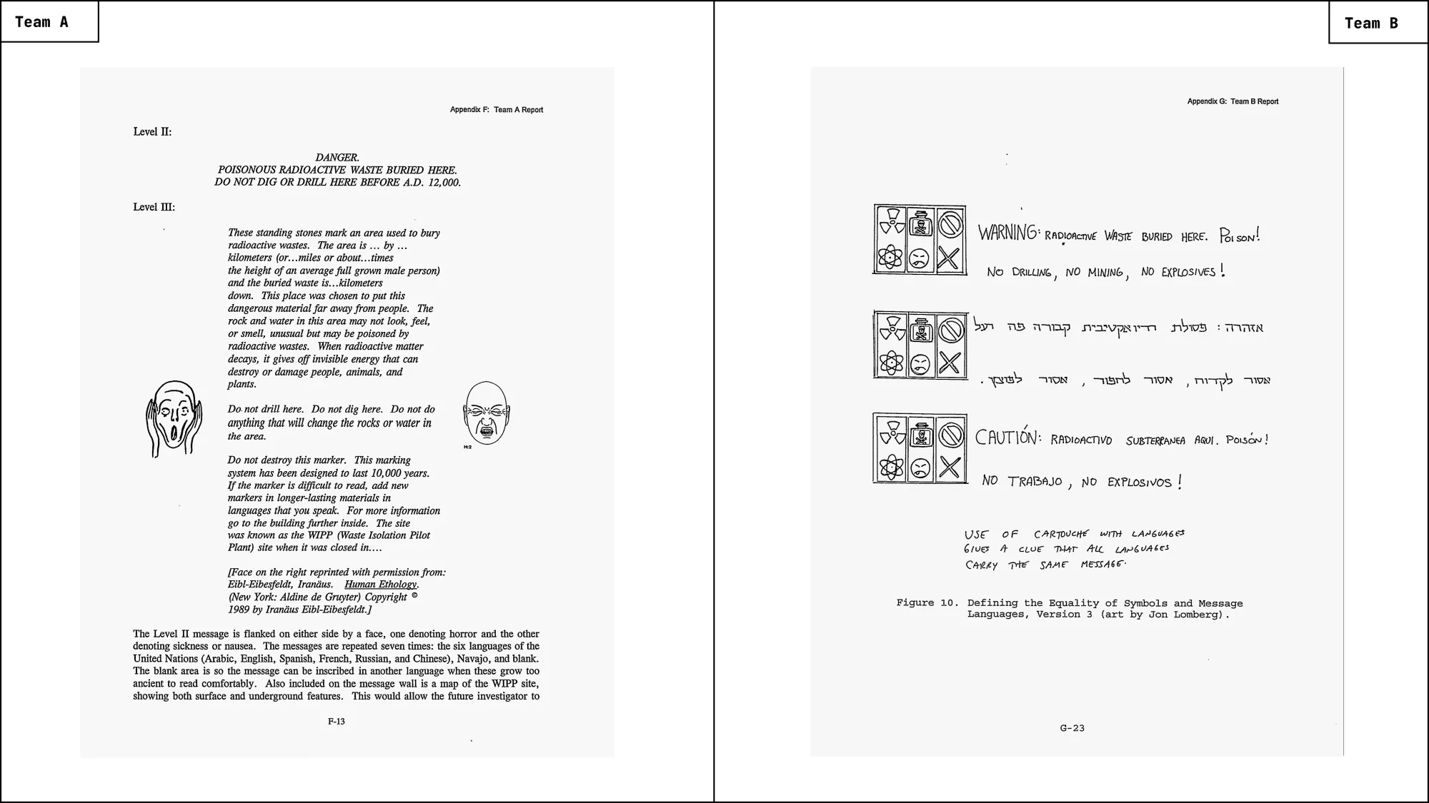
Team A is openly suspicious of graphics of any kind. In their view, visual symbols are not neutral carriers of meaning but fragile cultural artifacts, dependent on conventions that may vanish over time. Also diagrams, they argue, already assume too much: perspective, abstraction, shared habits of reading. Instead, their proposal repeatedly appeals to archetypes as the main principle – forms and expressions assumed to trigger deep, pre-cultural responses.
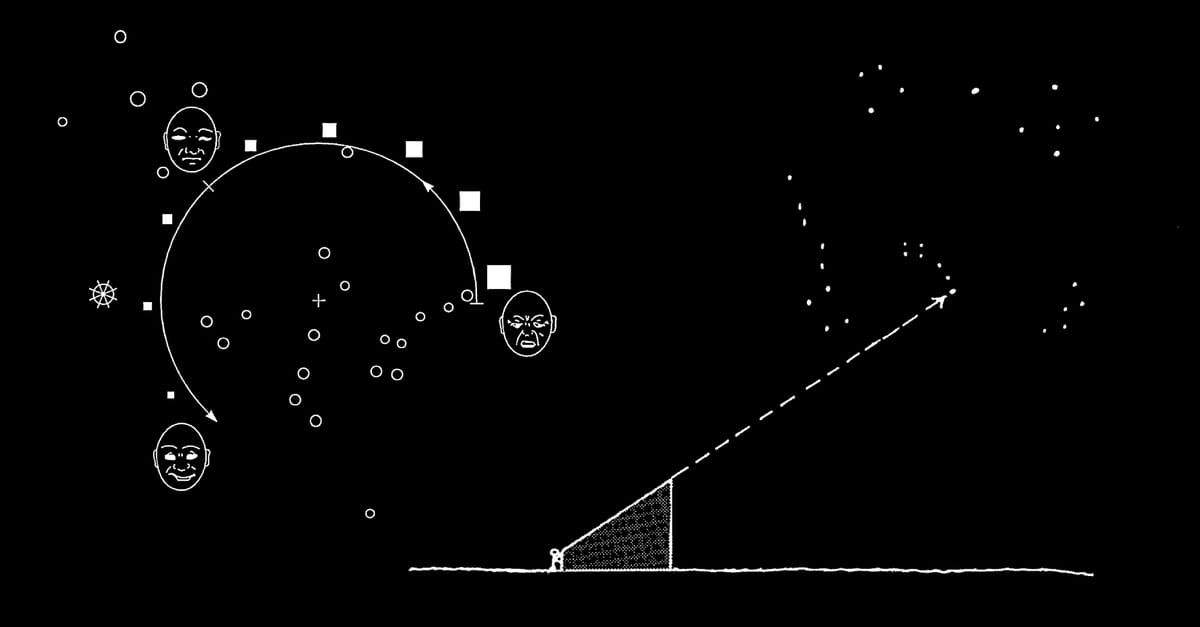
Accordingly, they propose visual representations of facial expressions not as signs to be decoded, but as a sort of biological trigger: expressions of fear, sickness, and pain presumed to be recognizable across cultures and epochs (Fig. 9).
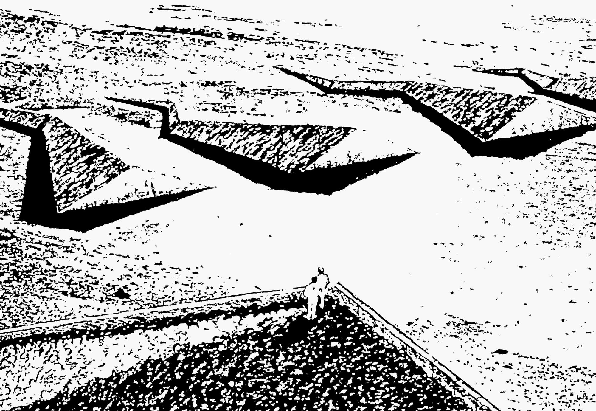
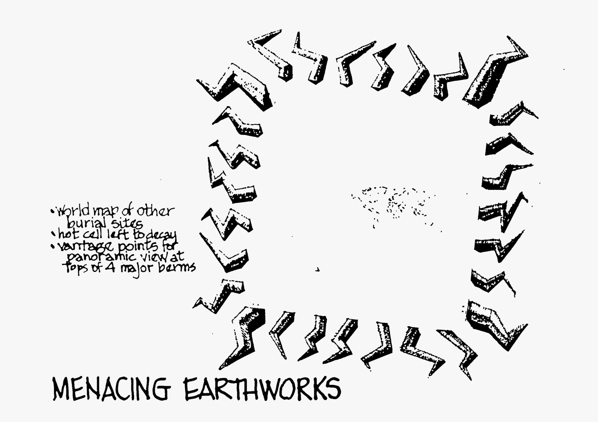
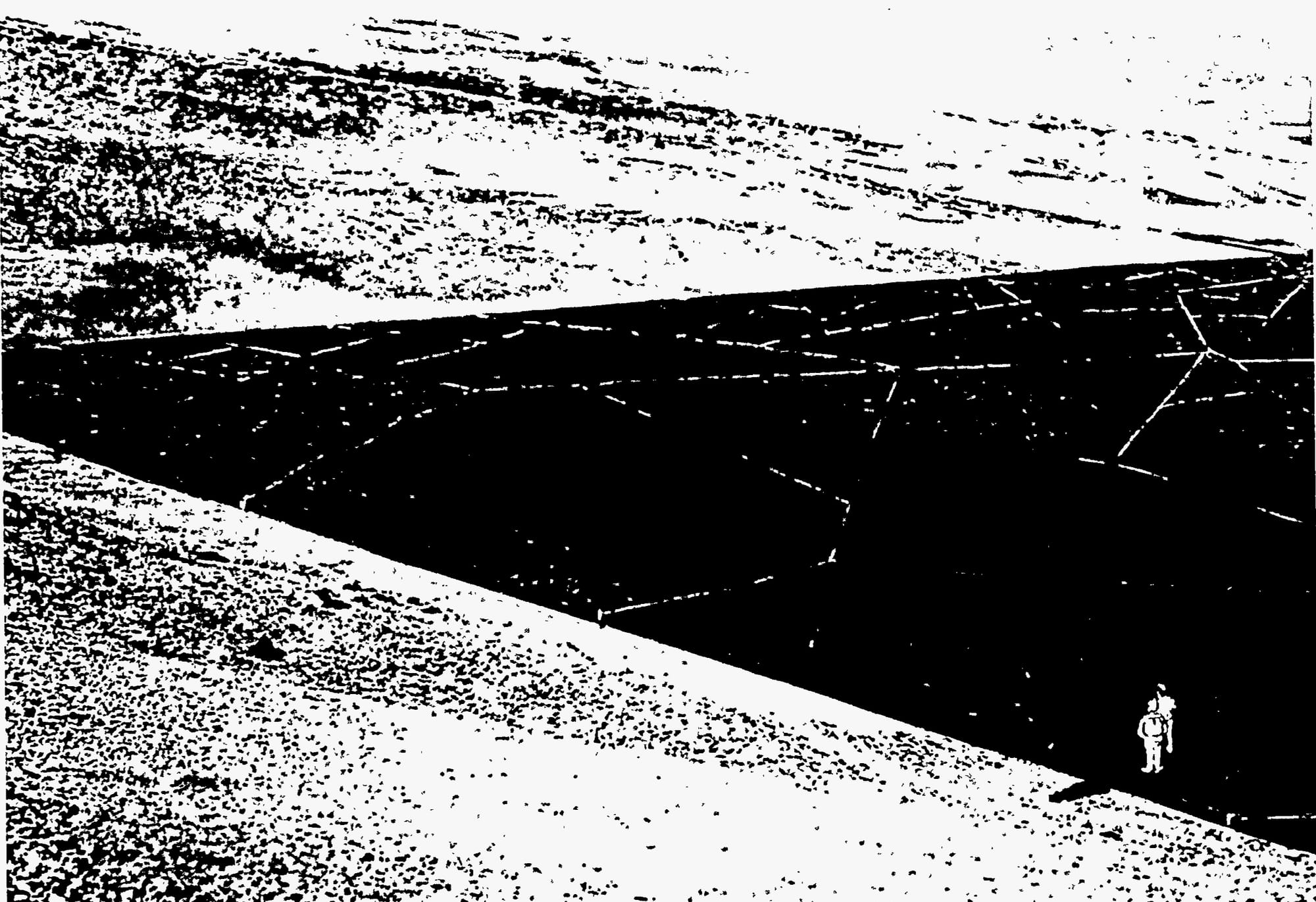
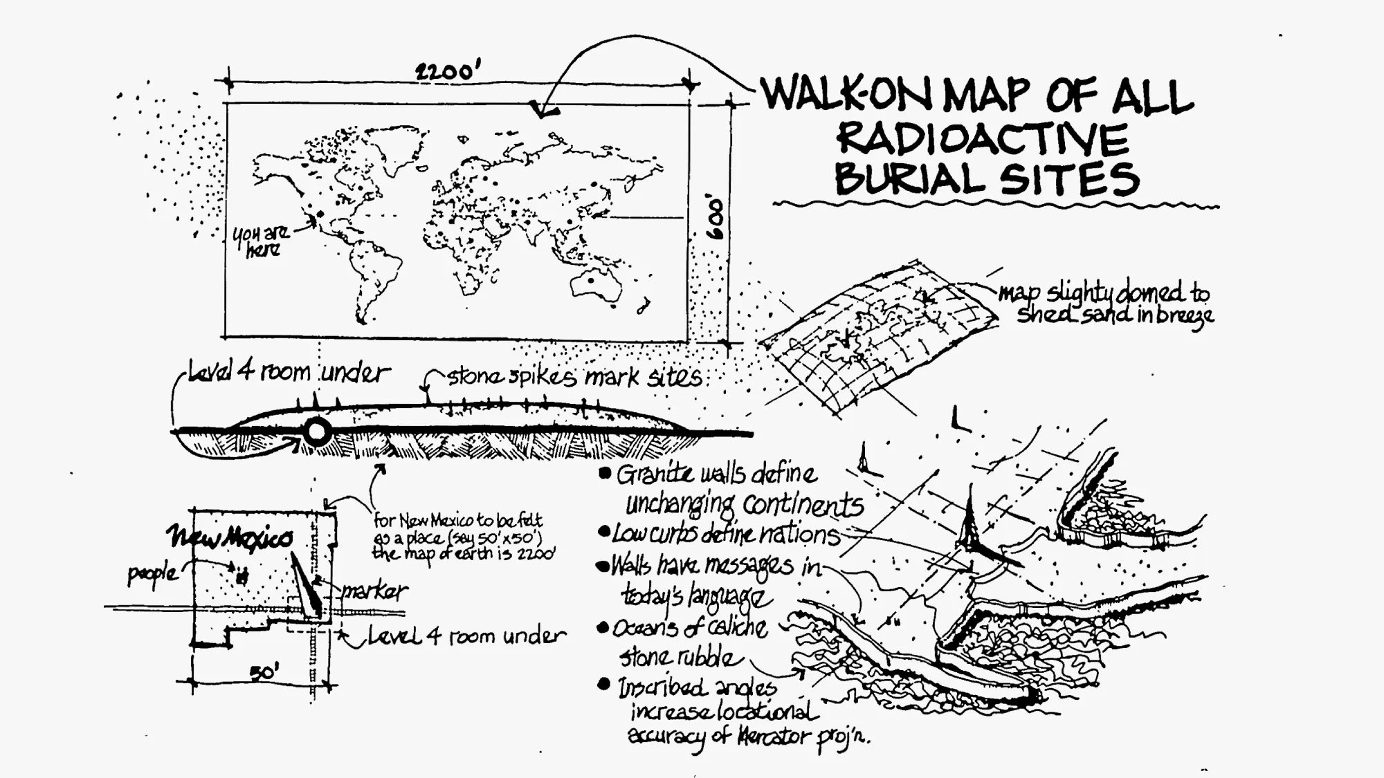
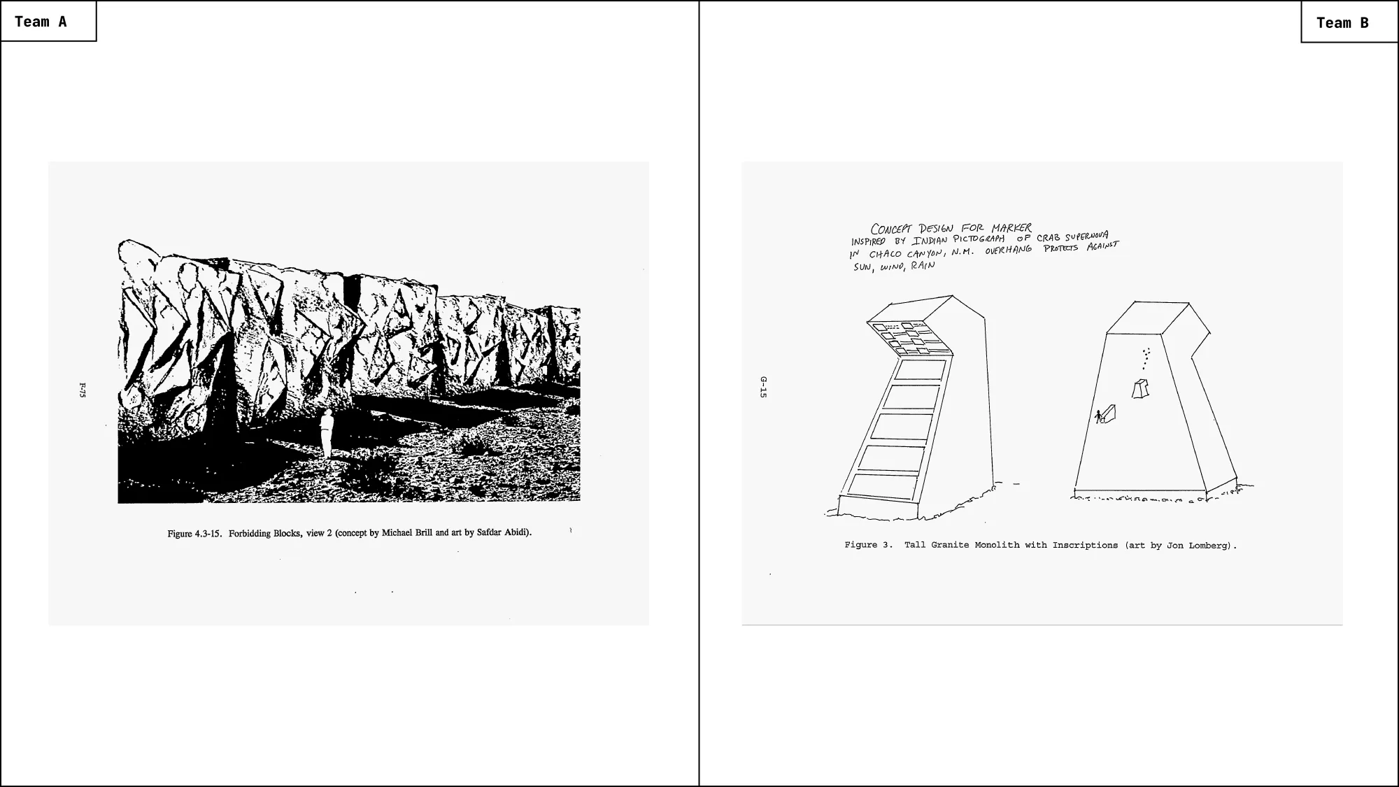
This principle extends into the visual language of the proposed architectural designs. Jagged stone forms, aggressive geometry, and huge spatial arrangements are meant to communicate danger without explanation. Even without understanding what lies beneath, a visitor should feel an urge to leave (Fig. 5, Fig. 7).
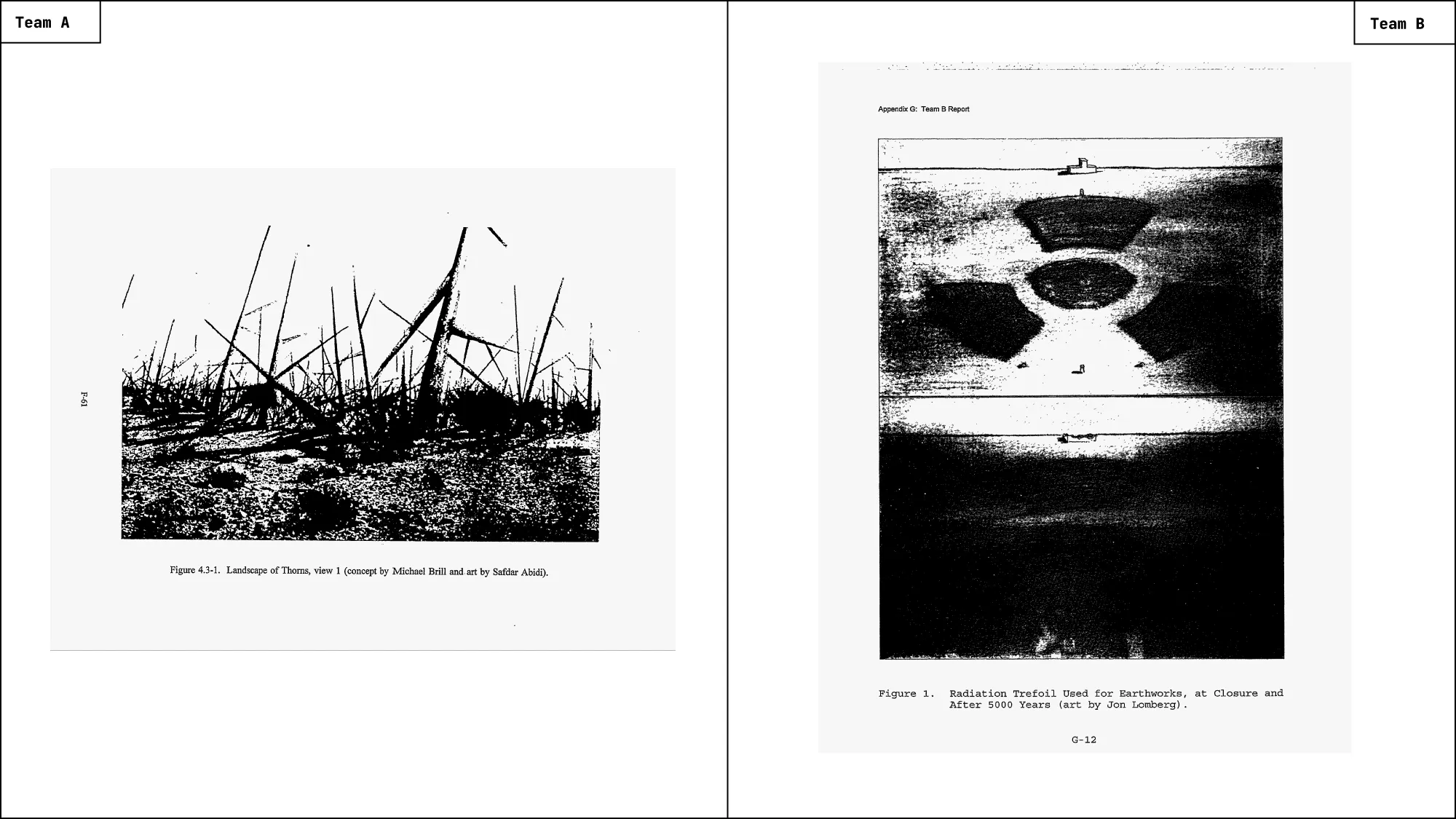
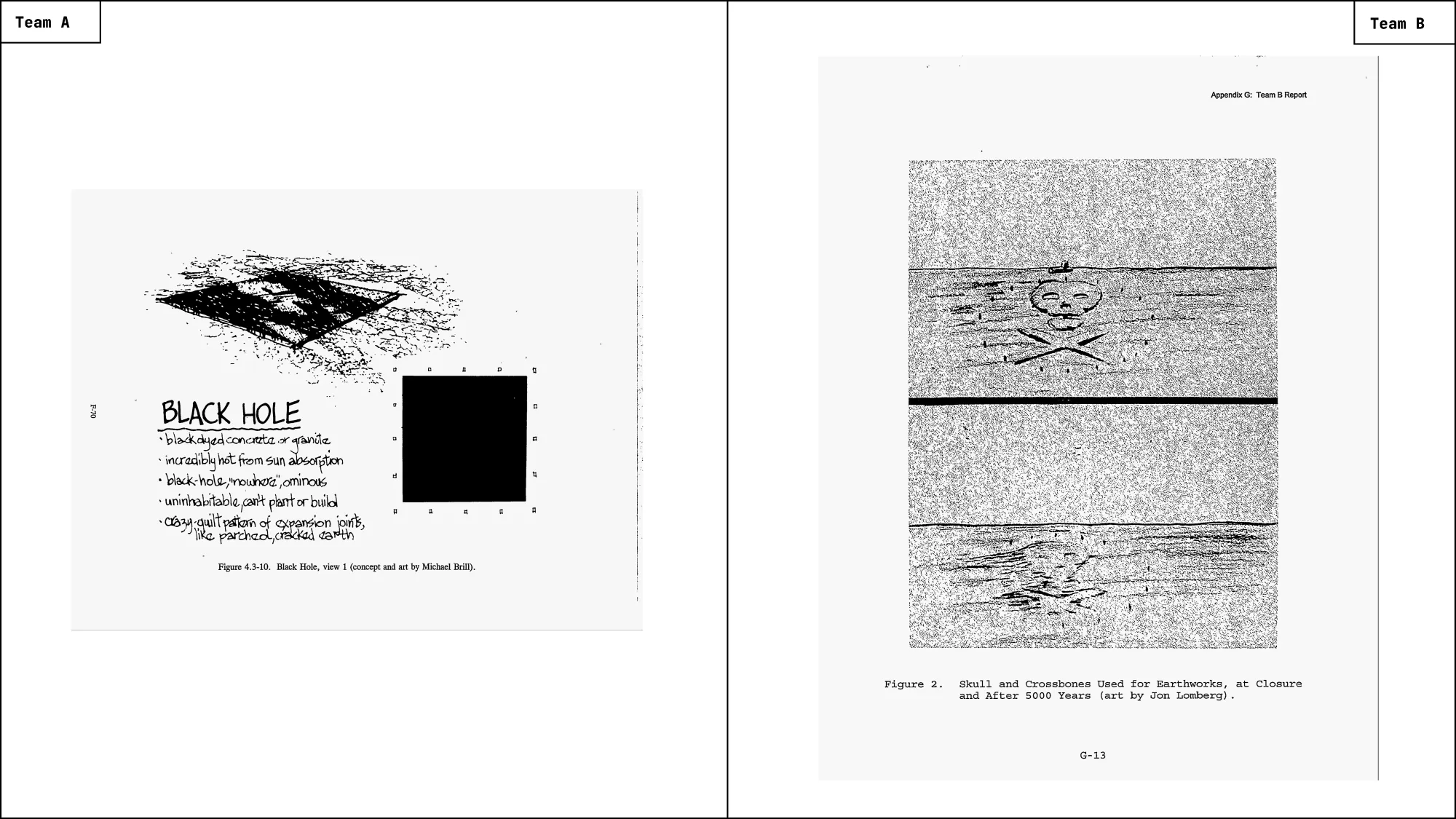
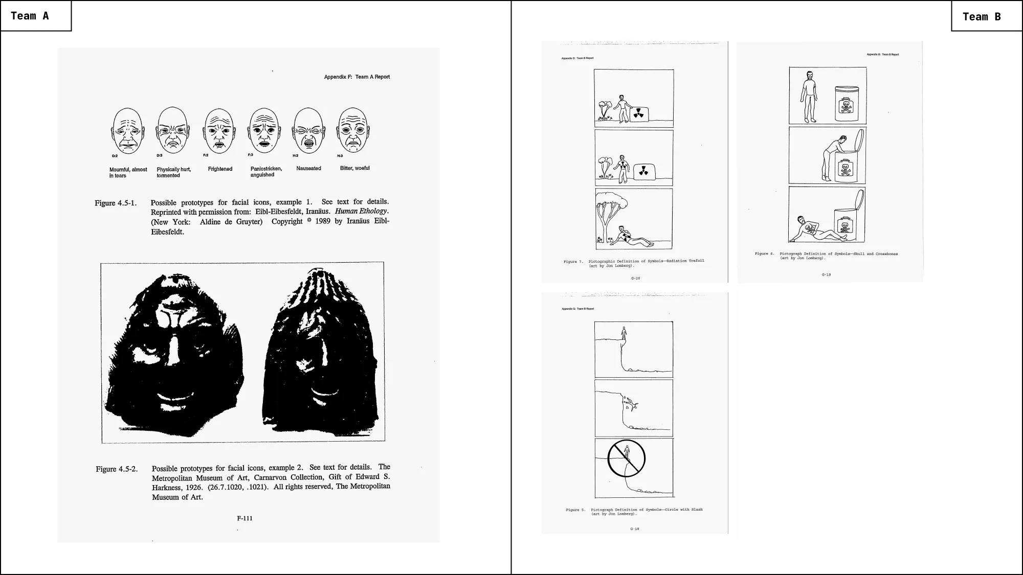
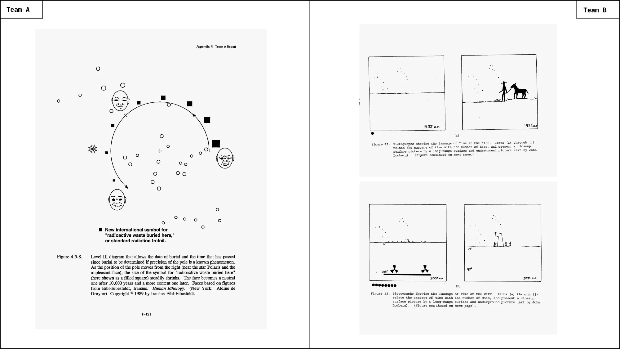
Team B in contrast, begins from the opposite premise. Rather than treating ambiguity as failure, they treat it as an unavoidable condition of deep time communication with a specific visual strategy: Signs and symbols, in their proposal, are not expected to speak for themselves. They are introduced gradually, embedded in sequences, and clarified through repetition and narrative progression. Consequently stick figures and pictographs appear again and again in their proposal, but rarely isolated. Their use unfolds across panels resembling instructional narratives – closer to comics than to signage – where understanding is built step by step (Fig. 10). In contrast to Team A, Team B treats architecture and earthworks as part of this semiotic system, still symbolic, just at landscape-scale (Fig. 6, Fig. 8).
This difference explains much of what follows. Team A’s designs are heavy, immovable, and overwhelming because they are meant to act immediately on the body. Team B’s designs are legible, layered, and open-ended because they are meant to be returned to, revisited, and reinterpreted (Fig. 12). One treats space as a deterrent. The other treats it as a medium.
Language as a Failing Medium
If architecture determines how a site is encountered, language determines what –if anything– can be said once that encounter begins. From the outset, the teams assume that understanding of language systems can not be taken for granted.
Team A proposes nevertheless to include inscriptions in the six official languages of the United Nations, alongside Navajo, selected explicitly because of its long-standing presence in the region. In their proposal, language is never allowed to carry the primary burden of communication. It functions as a supplementary layer—something that may help, but must not be required. This logic is palpable in the fictional scenario earlier which was written by Team A. When Jo and Steve encounter the carved markers, they notice the writing and even classify it correctly, but are not capable of decoding it (Fig. 13).
Team B approaches language differently, treating it as one layer within a larger communicative system. Their proposal does not specify a definitive set or number of languages. Instead, it argues for including multiple linguistic strata – major world languages, liturgical languages, and regionally relevant languages – without expecting any one of them to survive intact. Redundancy here seems to be a design principle; If one language disappears, others may persist. If all fail, symbols, sequences still may support meaning (Fig. 14).
Making Time Visible
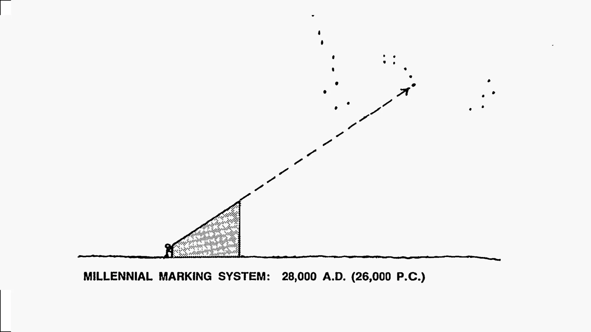
One of the most difficult challenges the teams had to address was how to communicate the passage of extremely long periods of time. The warning was not meant to last years or centuries, but millennia – and to convey that the danger buried at the site would persist long after any familiar language, symbol, or institution had disappeared. To address this problem, both teams turned to astronomy as a reference system capable of exceeding human timescales.
For Team A, astronomical references function primarily as stabilizing anchors. Despite their suspicion against graphics per se, star maps appear in their proposal as diagrams –global coordinates intended to situate the waste site within a larger spatial and especially temporal framework. The sky here operates as a constant reference system for time and space (Fig. 16).
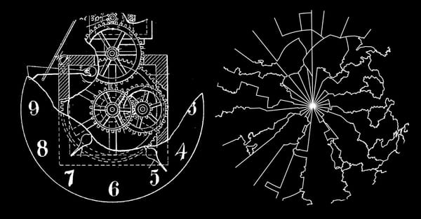
Team B approaches astronomy differently. Rather than using stars solely as static reference points in their image sequences (Fig. 17), they treat astronomical practice as part of the communicative system itself (Fig. 15). Their proposal relies on slow, observable processes: the gradual drift of stellar positions over centuries. These phenomena are not used to encode specific dates or measurements but to make duration of time itself readable.
In support of this approach, Team B reaches backward to pre-industrial and pre-mechanical systems of knowledge production. Their report refers explicitly to tools such as large stone observatories in India, most notably the Dhruva-Darshak Yantra (Fig. 18), a monumental architectural instrument built in the early eighteenth century to observe the Pole Star. Carved from stone and aligned to the sky, it required no moving parts, no written output, and no technological continuity (Fig. 15).
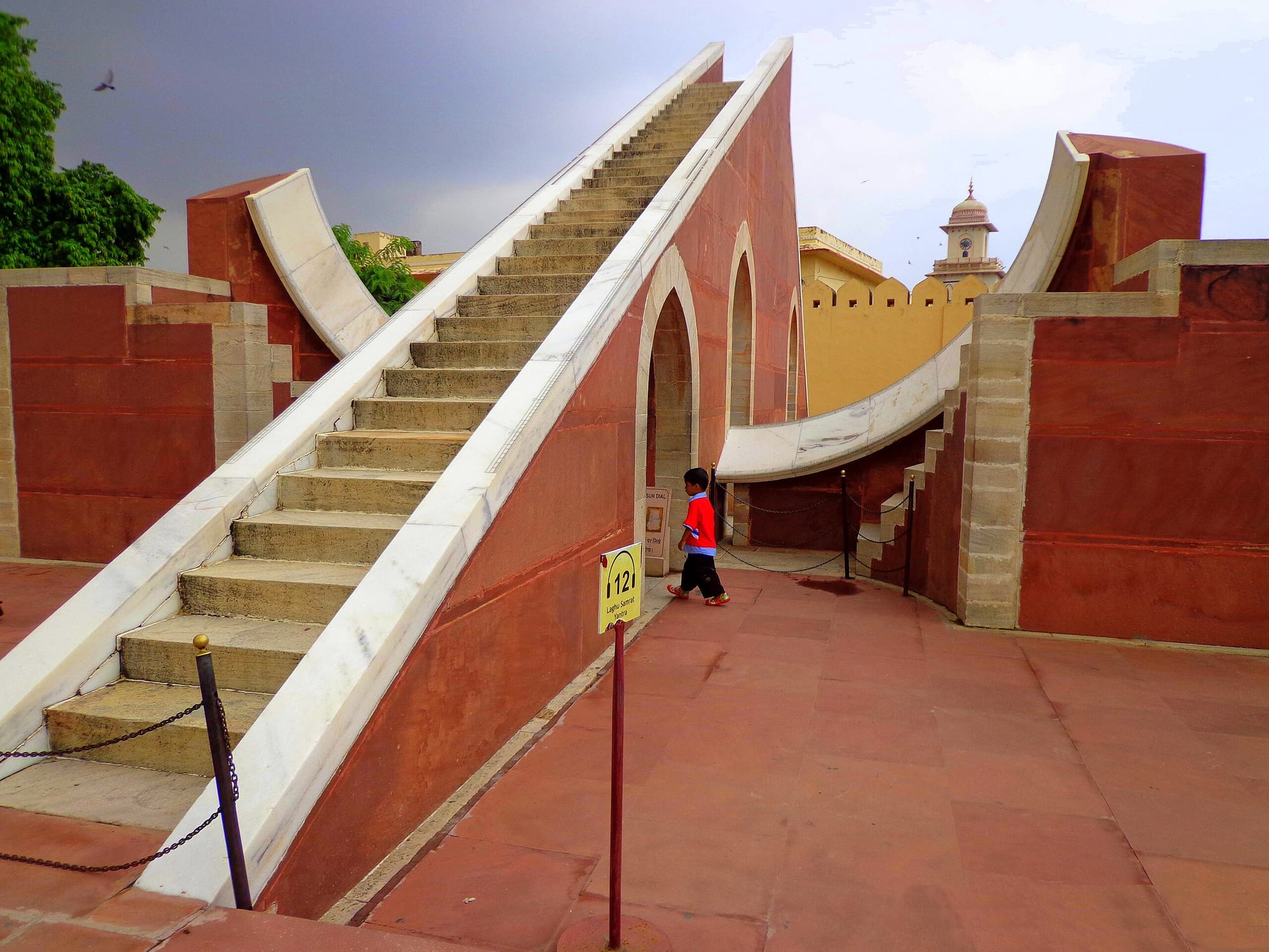
Through this tool, the sky becomes a readable medium through which time is experienced rather than calculated. Time is no longer something to be fixed in diagram, but something to be witnessed through recurring patterns.
Two Designs, Two Readers
Taken together, the two proposals do not simply represent different design solutions, but different assumptions about the future reader and how information might survive in deep time.
Team A responds to this uncertainty by minimizing the potential space of interpretation. Its design relies on deterrence – via archetypal expression in architecture, scale, shape and graphic. These expressions are meant to trigger avoidance before understanding is required.
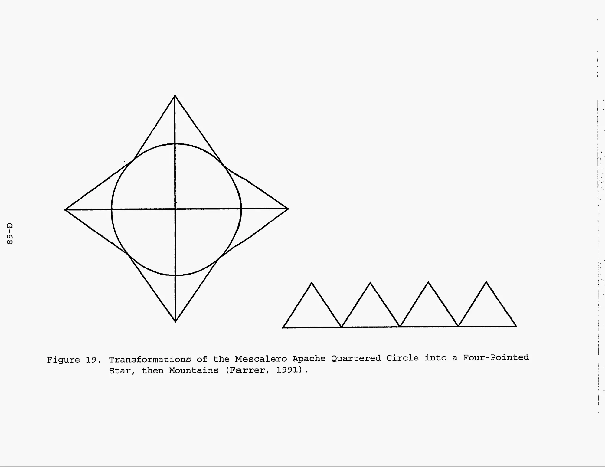
Team B assumes a different future reader. Rather than attempting to eliminate ambiguity, its proposal accepts uncertainty as an unavoidable condition of communication across millennia. Meaning is not delivered in a single moment; Instead, it is distributed across systems that can be encountered repeatedly and pieced together over time: pictographic sequences that unfold narratively and astronomical phenomena whose slow, observable cycles make duration itself legible. In support of this approach, Team B explicitly looks beyond modern information infrastructure. Their references points to long-lived cultural techniques – storytelling through image sequences, observational astronomy, indigenous symbols and place-based sign systems (Fig. 19) – as evidence that meaning can persist without centralized control, stable literacy, or technological maintenance.
At the edge of deep time, design is no longer concerned with preserving messages intact, but with designing systems that allow meaning to be re-learned, reconstructed, and interpreted anew.
*All shown Illustrations and Images, if not otherwise stated, are taken from the Sandia Report PDF
** The Introduction Text is copied from the Sandia Report but slightly shortened for editorial reasons
What is less frequently addressed is a close visual reading of the proposals as design objects: how differently the two teams approached image, language, architecture, and time, and how those differences allow a view on several visual strategies in information design.